CSS in Depth
brief contents
contents
foreword
preface
acknowledgments
about this book
Who should read this book
How this book is organized
Code conventions and repository
Browser versions
Note to print book readers
Book forum
About the author
About the cover illustration
Part 1—Reviewing the fundamentals
1 Cascade, specificity, and inheritance
1.1 The cascade
1.1.1 Understanding stylesheet origin
1.1.2 Understanding specificity
1.1.3 Understanding source order
1.1.4 Two rules of thumb
1.2 Inheritance
1.3 Special values
1.3.1 Using the inherit keyword
1.3.2 Using the initial keyword
1.4 Shorthand properties
1.4.1 Beware shorthands silently overriding other styles
1.4.2 Understanding the order of shorthand values
Summary
2 Working with relative units
2.1 The power of relative values
2.1.1 The struggle for pixel-perfect design
2.1.2 The end of the pixel-perfect web
2.2 Ems and rems
2.2.1 Using ems to define font-size
2.2.2 Using rems for font-size
2.3 Stop thinking in pixels
2.3.1 Setting a sane default font size
2.3.2 Making the panel responsive
2.3.3 Resizing a single component
2.4 Viewport-relative units
2.4.1 Using vw for font size
2.4.2 Using calc() for font size
2.5 Unitless numbers and line-height
2.6 Custom properties (aka CSS variables)
2.6.1 Changing custom properties dynamically
2.6.2 Changing custom properties with JavaScript
2.6.3 Experimenting with custom properties
3 Mastering the box model
3.1 Difficulties with element width
3.1.1 Avoiding magic numbers
3.1.2 Adjusting the box model
3.1.3 Using universal border-box sizing
3.1.4 Adding a gutter between columns
3.2 Difficulties with element height
3.2.1 Controlling overflow behavior
3.2.2 Applying alternatives to percentage-based heights
3.2.3 Using min-height and max-height
3.2.4 Vertically centering content
3.3 Negative margins
3.4 Collapsed margins
3.4.1 Collapsing between text
3.4.2 Collapsing multiple margins
3.4.3 Collapsing outside a container
3.5 Spacing elements within a container
3.5.1 Considering changing content
3.5.2 Creating a more general solution: the lobotomized owl selector
Summary
Part 2—Mastering layout
4 Making sense of floats
4.1 The purpose of floats
4.2 Container collapsing and the clearfix
4.2.1 Understanding container collapsing
4.2.2 Understanding the clearfix
4.3 Unexpected “float catching”
4.4 Media objects and block formatting contexts
4.4.1 Establishing a block formatting context
4.4.2 Using a block formatting context for media object layouts
4.5 Grid systems
4.5.1 Understanding a grid system
4.5.2 Building a grid system
4.5.3 Adding gutters
Summary
5 Flexbox
5.1 Flexbox principles
5.1.1 Building a basic flexbox menu
5.1.2 Adding padding and spacing
5.2 Flex item sizes
5.2.1 Using the flex-basis property
5.2.2 Using flex-grow
5.2.3 Using flex-shrink
5.2.4 Some practical uses
5.3 Flex direction
5.3.1 Changing the flex direction
5.3.2 Styling the login form
5.4 Alignment, spacing, and other details
5.4.1 Understanding flex container properties
5.4.2 Understanding flex item properties
5.4.3 Using alignment properties
5.5 A couple of things to be aware of
5.5.1 Flexbugs
5.5.2 Full-page layout
Summary
6 Grid layout
6.1 Web layout is here
6.1.1 Building a basic grid
6.2 Anatomy of a grid
6.2.1 Numbering grid lines
6.2.2 Working together with flexbox
6.3 Alternate syntaxes
6.3.1 Naming grid lines
6.3.2 Naming grid areas
6.4 Explicit and implicit grid
6.4.1 Adding variety
6.4.2 Adjusting grid items to fill the grid track
6.5 Feature queries
6.6 Alignment
7 Positioning and stacking contexts
7.1 Fixed positioning
7.1.1 Creating a modal dialog with fixed positioning
7.1.2 Controlling the size of positioned elements
7.2 Absolute positioning
7.2.1 Absolutely positioning the Close button
7.2.2 Positioning a pseudo-element
7.3 Relative positioning
7.3.1 Creating a dropdown menu
7.3.2 Creating a CSS triangle
7.4 Stacking contexts and z-index
7.4.1 Understanding the rendering process and stacking order
7.4.2 Manipulating stacking order with z-index
7.4.3 Understanding stacking contexts
7.5 Sticky positioning
Summary
8 Responsive design
8.1 Mobile first
8.1.1 Creating a mobile menu
8.1.2 Adding the viewport meta tag
8.2 Media queries
8.2.1 Understanding types of media query
8.2.2 Adding breakpoints to the page
8.2.3 Adding responsive columns
8.3 Fluid layouts
8.3.1 Adding styles for a large viewport
8.3.2 Dealing with tables
8.4 Responsive images
8.4.1 Using multiple images for different viewport sizes
8.4.2 Using srcset to serve the correct image
Summary
Part 3—CSS at scale
9 Modular CSS
9.1 Base styles: laying the groundwork
9.2 A simple module
9.2.1 Variations of a module
9.2.2 Modules with multiple elements
9.3 Modules composed into larger structures
9.3.1 Dividing multiple responsibilities among modules
9.3.2 Naming modules
9.4 Utility classes
9.5 CSS methodologies
10 Pattern libraries
10.1 Introduction to KSS
10.1.1 Setting up KSS
10.1.2 Writing KSS documentation
10.1.3 Documenting module variants
10.1.4 Creating an overview page
10.1.5 Documenting modules that require JavaScript
10.1.6 Organizing the pattern library into sections
10.2 Shifting the way you build CSS
10.2.1 Using a CSS First workflow
10.2.2 Using a pattern library as an API
Part 4—Advanced topics
11 Backgrounds, shadows, and blend modes
11.1 Gradients
11.1.1 Using multiple color stops
11.1.2 Using radial gradients
11.2 Shadows
11.2.1 Defining depth with gradients and shadows
11.2.2 Creating elements with a flat design
11.2.3 Creating buttons with a more modern look
11.3 Blend modes
11.3.1 Tinting an image
11.3.2 Understanding types of blend mode
11.3.3 Adding texture to an image
11.3.4 Using mix blend modes
Summary
12 Contrast, color, and spacing
12.1 Contrast is king
12.1.1 Establishing patterns
12.1.2 Implementing the design
12.2 Color
12.2.1 Understanding color notations
12.2.2 Adding new colors to a palette
12.2.3 Considering contrast for font colors
12.3 Spacing
12.3.1 Using ems vs. px
12.3.2 Factoring in line height
12.3.3 Spacing inline elements
13 Typography
13.1 Web fonts
13.2 Google fonts
13.3 How @font-face works
13.3.1 Font formats and fallbacks
13.3.2 Multiple variants of the same typeface
13.4 Adjusting space for readability
13.4.1 Body copy spacing
13.4.2 Headings, small elements, and spacing
13.5 The dreaded FOUT and FOIT
13.5.1 Using Font Face Observer
13.5.2 Falling back to system fonts
13.5.3 Getting ready for font-display
14 Transitions
14.1 From here to there
14.2 Timing functions
14.2.1 Understanding Bézier curves
14.2.2 Steps
14.3 Non-animatable properties
14.3.1 Properties that cannot be animated
14.3.2 Fading in and out
14.4 Transitioning to auto height
Summary
15 Transforms
15.1 Rotate, translate, scale, and skew
15.1.1 Changing the transform origin
15.1.2 Applying multiple transforms
15.2 Transforms in motion
15.2.1 Scaling up the icon
15.2.2 Creating “fly in” labels
15.2.3 Staggering the transitions
15.3 Animation performance
15.3.1 Looking at the rendering pipeline
15.4 Three-dimensional (3D) transforms
15.4.1 Controlling perspective
15.4.2 Implementing advanced 3D transforms
Summary
16 Animations
16.1 Keyframes
16.2 Animating 3D transforms
16.2.1 Building the layout without animations
16.2.2 Adding animation to the layout
16.3 Animation delay and fill mode
16.4 Conveying meaning through animation
16.4.1 Responding to user interaction
16.4.2 Drawing the user’s attention
16.5 One final piece of advice
Appendix A—Selectors reference
A.1 Basic selectors
A.2 Combinators
A.3 Pseudo-class selectors
A.4 Pseudo-element selectors
A.5 Attribute selectors
Appendix B—Preprocessors
B.1 Sass
B.1.1 Installing Sass
B.1.2 Running Sass
B.1.3 Understanding important Sass features
B.2 PostCSS
B.2.1 Using Autoprefixer
B.2.2 Using cssnext
B.2.3 Using cssnano
B.2.4 Using PreCSS
index
Symbols
A
B
C
D
E
F
G
H
I
J
K
L
M
N
O
P
Q
R
S
T
U
V
W
Y
Z
CSS in Depth—back cover


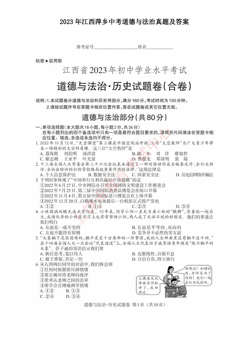 2023年江西萍乡中考道德与法治真题及答案.doc
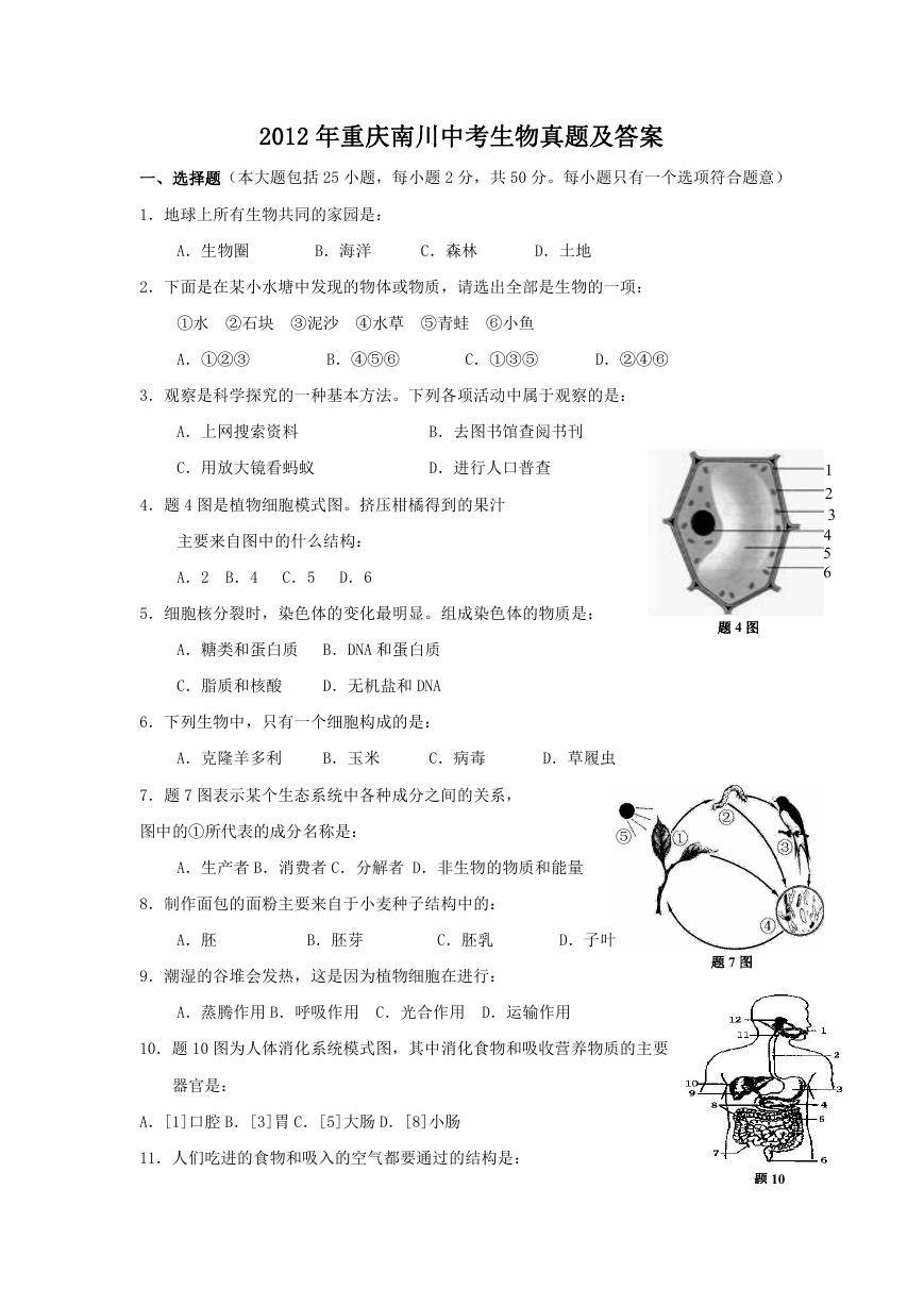 2012年重庆南川中考生物真题及答案.doc
 2013年江西师范大学地理学综合及文艺理论基础考研真题.doc
 2020年四川甘孜小升初语文真题及答案I卷.doc
 2020年注册岩土工程师专业基础考试真题及答案.doc
 2023-2024学年福建省厦门市九年级上学期数学月考试题及答案.doc
 2021-2022学年辽宁省沈阳市大东区九年级上学期语文期末试题及答案.doc
 2022-2023学年北京东城区初三第一学期物理期末试卷及答案.doc
 2018上半年江西教师资格初中地理学科知识与教学能力真题及答案.doc
 2012年河北国家公务员申论考试真题及答案-省级.doc
 2020-2021学年江苏省扬州市江都区邵樊片九年级上学期数学第一次质量检测试题及答案.doc
 2022下半年黑龙江教师资格证中学综合素质真题及答案.doc
 2022-2023学年河北省唐山市高三上学期期末数学试题及答案.doc
 2022-2023学年河北省张家口市高三上学期期末数学试题及答案.doc
 2022-2023学年河北省衡水市高三上学期期末语文试题及答案.doc
 2022-2023学年河北省保定市高三上学期期末数学试题及答案.doc
 2022-2023学年河北省张家口市高三上学期期末语文试题及答案.doc
 2022-2023学年河北省石家庄市高三上学期期末语文试题及答案.doc
 2020-2021年四川省凉山州西昌市高一物理上学期期中试卷及答案.doc
 2020-2021年四川省遂宁市安居区高一英语上学期期中试卷及答案.doc
 2020-2021年四川省西昌市高一英语上学期期中试卷及答案.doc
 2021-2022年四川省广安市岳池县高一地理上学期期中试卷及答案.doc
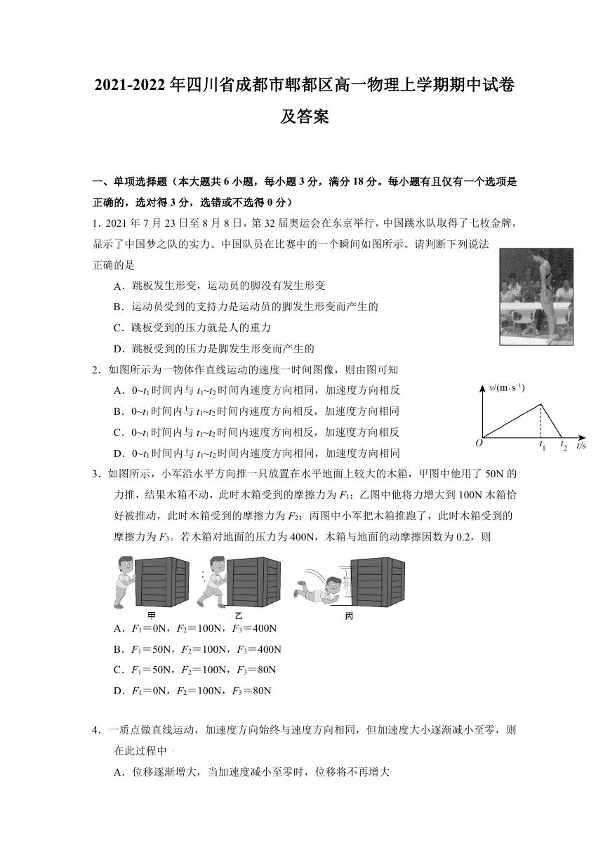 2021-2022年四川省成都市郫都区高一物理上学期期中试卷及答案.doc
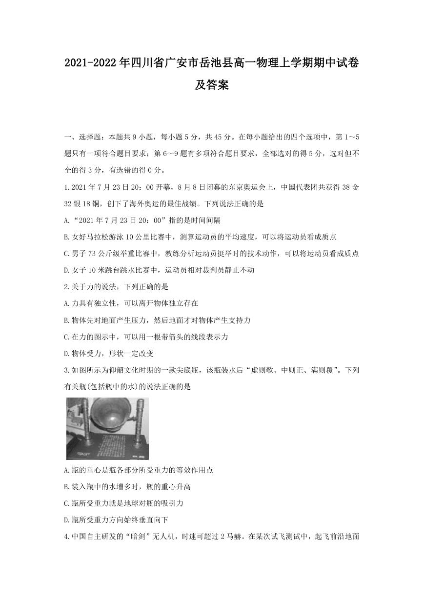 2021-2022年四川省广安市岳池县高一物理上学期期中试卷及答案.doc