Founded in 2010, Kaggle is a Data Science platform where users can
share, collaborate, and compete. One key feature of Kaggle is “Compe-
titions”, which o�ers users the ability to practice on real world data
and to test their skills with, and against, an international community.
This guide will teach you how to approach and enter a Kaggle competi-
tion, including exploring the data, creating and engineering features,
building models, and submitting predictions. We’ll use Python 3 and
Jupyter Notebook.
G
e
t
t
i
n
g
t
a
r
t
e
d
w
i
t
h
K
a
g
g
l
e
:
H
o
u
e
P
r
i
c
e
C
o
m
p
e
t
i
t
i
o
n
A
d
a
m
M
a
a
c
h
i
0
5
M
A
Y
2
0
1
7
i
n
t
u
t
o
r
i
a
l
,
p
t
h
o
n
,
a
n
d
k
a
g
g
l
e
�
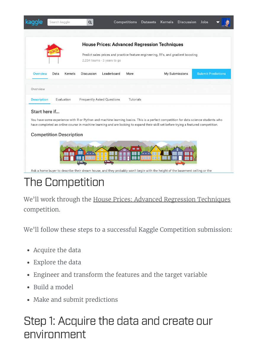
We’ll work through the House Prices: Advanced Regression Techniques
competition.
We’ll follow these steps to a successful Kaggle Competition submission:
Acquire the data
Explore the data
Engineer and transform the features and the target variable
Build a model
Make and submit predictions
T
h
e
C
o
m
p
e
t
i
t
i
o
n
t
e
p
1
:
A
c
q
u
i
r
e
t
h
e
d
a
t
a
a
n
d
c
r
e
a
t
e
o
u
r
e
n
v
i
r
o
n
m
e
n
t
�
We need to acquire the data for the competition. The descriptions of the
features and some other helpful information are contained in a �le with
an obvious name, data_description.txt .
Download the data and save it into a folder where you’ll keep every-
thing you need for the competition.
We will �rst look at the train.csv data. After we’ve trained a model,
we’ll make predictions using the test.csv data.
First, import Pandas, a fantastic library for working with data in
Python. Next we’ll import Numpy.
import pandas as pd
import numpy as np
We can use Pandas to read in csv �les. The pd.read_csv() method cre-
ates a DataFrame from a csv �le.
train = pd.read_csv('train.csv')
test = pd.read_csv('test.csv')
Let’s check out the size of the data.
print ("Train data shape:", train.shape)
print ("Test data shape:", test.shape)
Train data shape: (1460, 81)
Test data shape: (1459, 80)
We see that test has only 80 columns, while train has 81. This is due
to, of course, the fact that the test data do not include the �nal sale
price information!
�
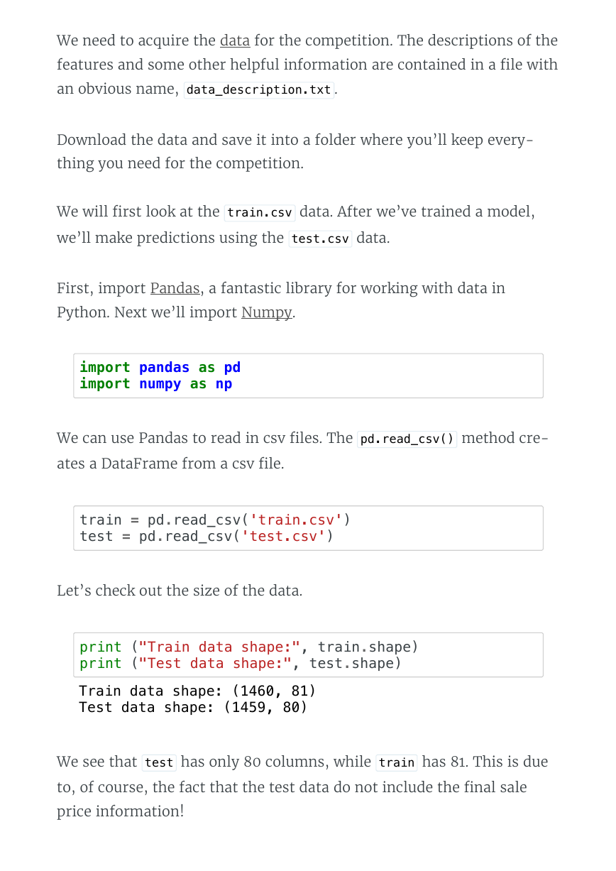
Next, we’ll look at a few rows using the DataFrame.head() method.
train.head()
Id MSSubClass MSZoning LotFrontage LotArea Street Alley
Pave NaN
Pave NaN
Pave NaN
Pave NaN
Pave NaN
8450
9600
11250
9550
14260
0 1 60
1 2 20
2 3 60
3 4 70
4 5 60
RL
RL
RL
RL
RL
65.0
80.0
68.0
60.0
84.0
We should have the data dictionary available in our folder for the
competition. You can also �nd it here.
Here’s a brief version of what you’ll �nd in the data description �le:
SalePrice - the property’s sale price in dollars. This is the target
variable that you’re trying to predict.
MSSubClass - The building class
MSZoning - The general zoning classi�cation
LotFrontage - Linear feet of street connected to property
LotArea - Lot size in square feet
Street - Type of road access
Alley - Type of alley access
LotShape - General shape of property
LandContour - Flatness of the property
Utilities - Type of utilities available
LotConfig - Lot con�guration
�
And so on.
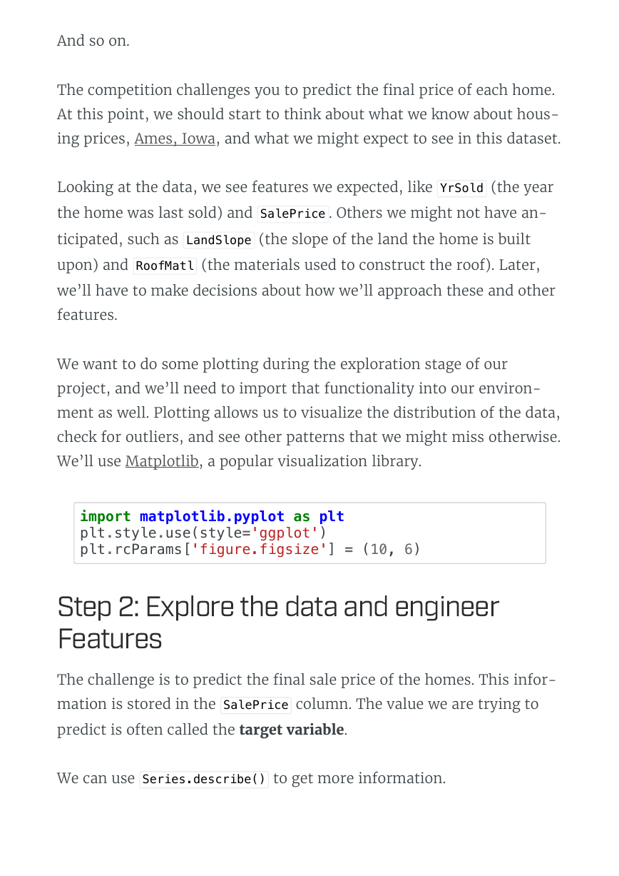
The competition challenges you to predict the �nal price of each home.
At this point, we should start to think about what we know about hous-
ing prices, Ames, Iowa, and what we might expect to see in this dataset.
Looking at the data, we see features we expected, like YrSold (the year
the home was last sold) and SalePrice . Others we might not have an-
ticipated, such as LandSlope (the slope of the land the home is built
upon) and RoofMatl (the materials used to construct the roof). Later,
we’ll have to make decisions about how we’ll approach these and other
features.
We want to do some plotting during the exploration stage of our
project, and we’ll need to import that functionality into our environ-
ment as well. Plotting allows us to visualize the distribution of the data,
check for outliers, and see other patterns that we might miss otherwise.
We’ll use Matplotlib, a popular visualization library.
import matplotlib.pyplot as plt
plt.style.use(style='ggplot')
plt.rcParams['figure.figsize'] = (10, 6)
The challenge is to predict the �nal sale price of the homes. This infor-
mation is stored in the SalePrice column. The value we are trying to
predict is often called the target variable.
We can use Series.describe() to get more information.
t
e
p
2
:
x
p
l
o
r
e
t
h
e
d
a
t
a
a
n
d
e
n
g
i
n
e
e
r
F
e
a
t
u
r
e
�
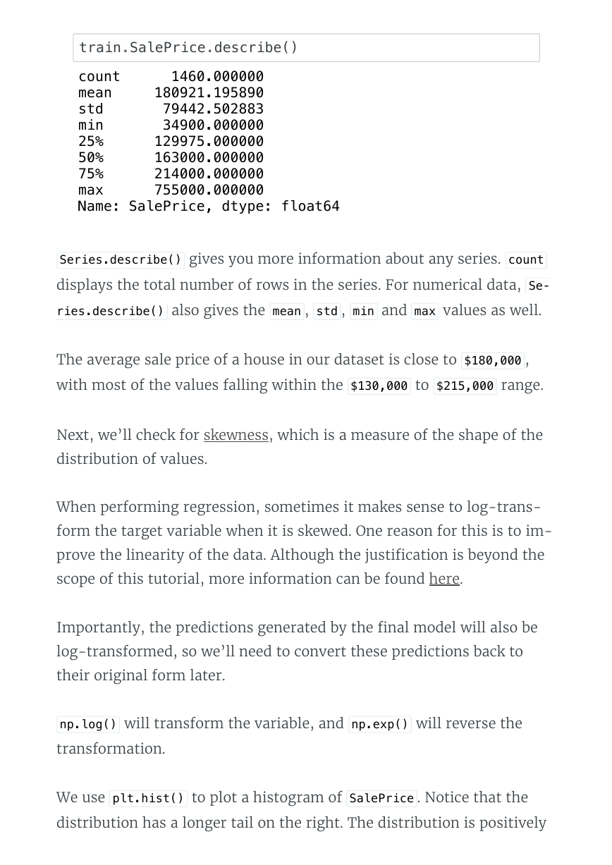
train.SalePrice.describe()
count 1460.000000
mean 180921.195890
std 79442.502883
min 34900.000000
25% 129975.000000
50% 163000.000000
75% 214000.000000
max 755000.000000
Name: SalePrice, dtype: float64
Series.describe() gives you more information about any series. count
displays the total number of rows in the series. For numerical data, Se‐
ries.describe() also gives the mean , std , min and max values as well.
The average sale price of a house in our dataset is close to $180,000 ,
with most of the values falling within the $130,000 to $215,000 range.
Next, we’ll check for skewness, which is a measure of the shape of the
distribution of values.
When performing regression, sometimes it makes sense to log-trans-
form the target variable when it is skewed. One reason for this is to im-
prove the linearity of the data. Although the justi�cation is beyond the
scope of this tutorial, more information can be found here.
Importantly, the predictions generated by the �nal model will also be
log-transformed, so we’ll need to convert these predictions back to
their original form later.
np.log() will transform the variable, and np.exp() will reverse the
transformation.
We use plt.hist() to plot a histogram of SalePrice . Notice that the
distribution has a longer tail on the right. The distribution is positively
�
skewed.
print ("Skew is:", train.SalePrice.skew())
plt.hist(train.SalePrice, color='blue')
plt.show()
Skew is: 1.88287575977
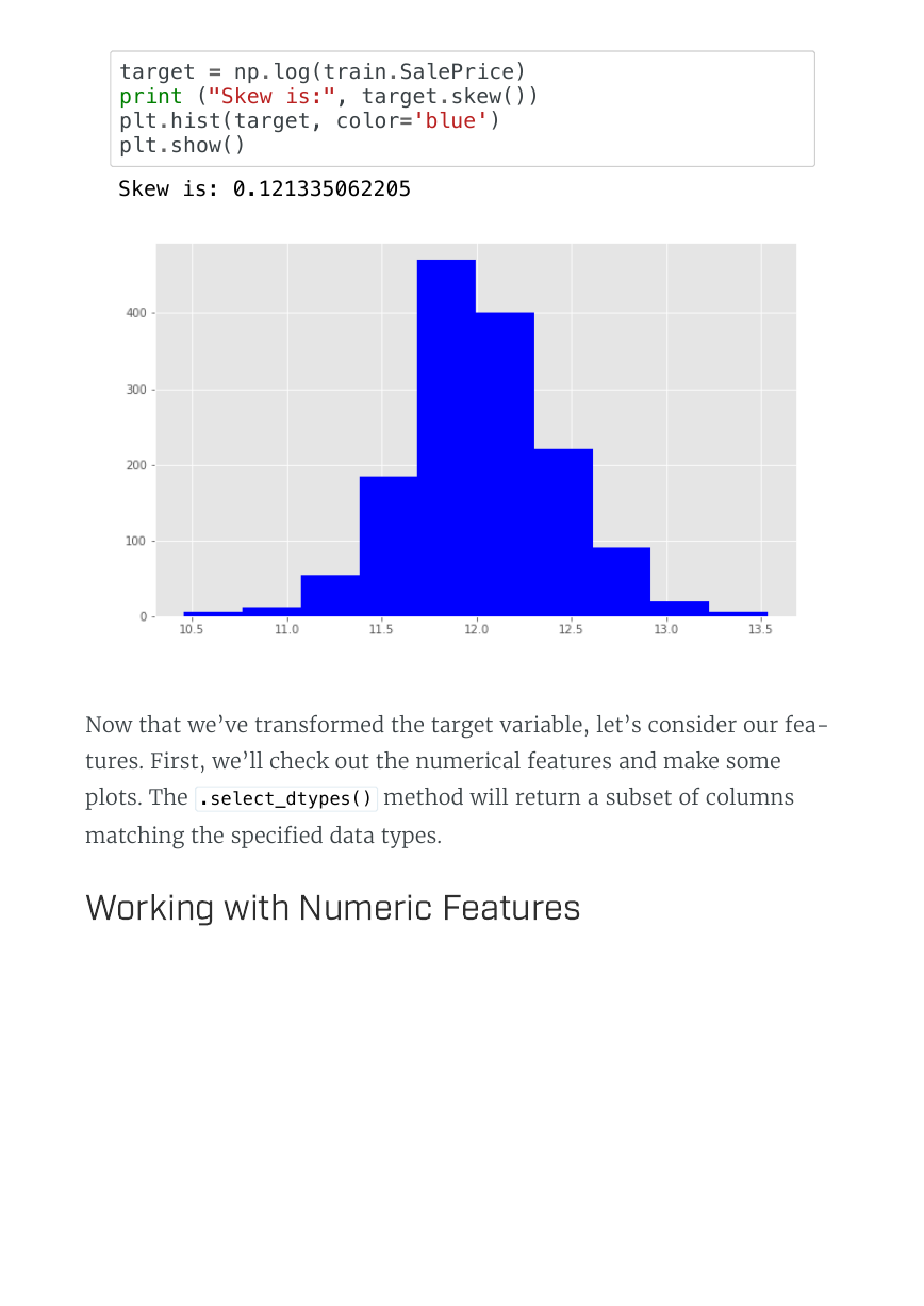
Now we use np.log() to transform train.SalePric and calculate the
skewness a second time, as well as re-plot the data. A value closer to 0
means that we have improved the skewness of the data. We can see vi-
sually that the data will more resembles a normal distribution.
�
target = np.log(train.SalePrice)
print ("Skew is:", target.skew())
plt.hist(target, color='blue')
plt.show()
Skew is: 0.121335062205
Now that we’ve transformed the target variable, let’s consider our fea-
tures. First, we’ll check out the numerical features and make some
plots. The .select_dtypes() method will return a subset of columns
matching the speci�ed data types.
W
o
r
k
i
n
g
w
i
t
h
N
u
m
e
r
i
c
F
e
a
t
u
r
e
�



 2023年江西萍乡中考道德与法治真题及答案.doc
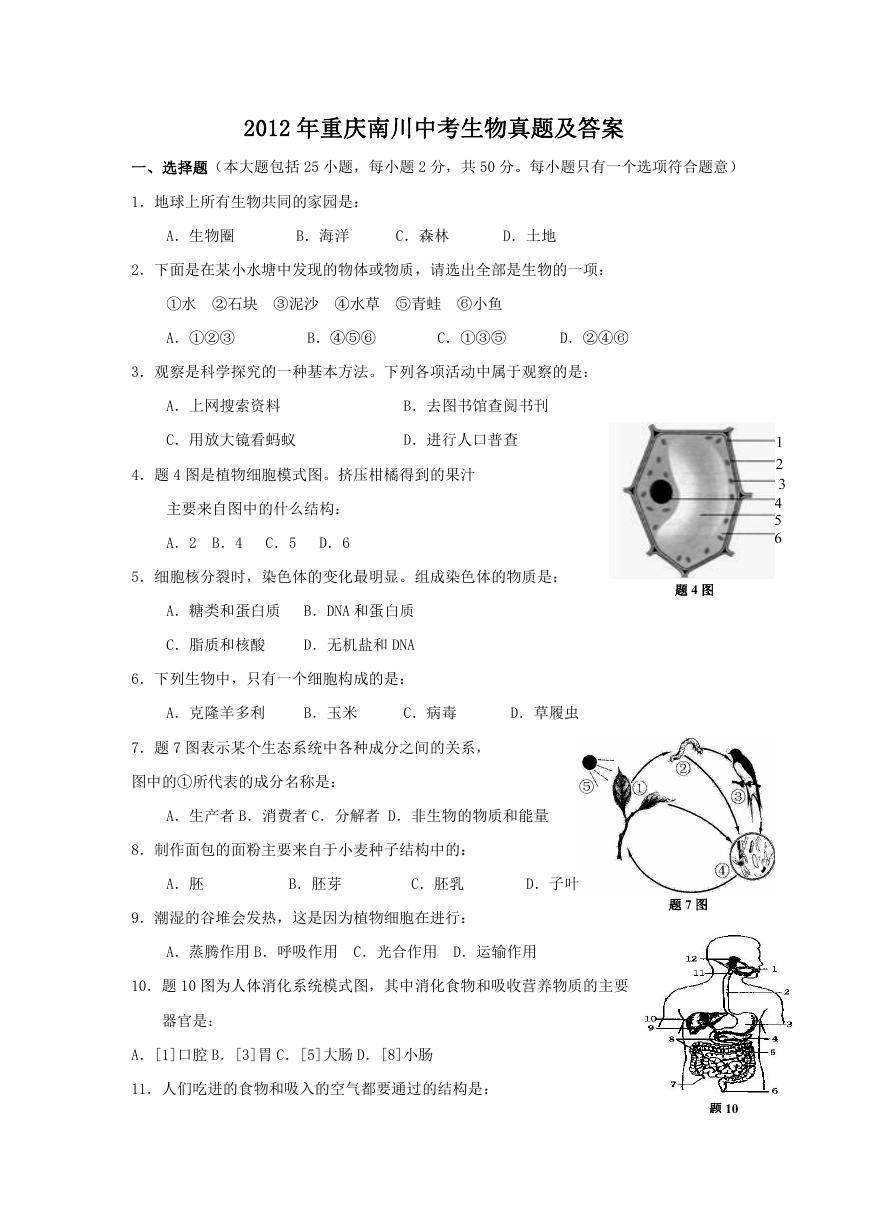 2012年重庆南川中考生物真题及答案.doc
 2013年江西师范大学地理学综合及文艺理论基础考研真题.doc
 2020年四川甘孜小升初语文真题及答案I卷.doc
 2020年注册岩土工程师专业基础考试真题及答案.doc
 2023-2024学年福建省厦门市九年级上学期数学月考试题及答案.doc
 2021-2022学年辽宁省沈阳市大东区九年级上学期语文期末试题及答案.doc
 2022-2023学年北京东城区初三第一学期物理期末试卷及答案.doc
 2018上半年江西教师资格初中地理学科知识与教学能力真题及答案.doc
 2012年河北国家公务员申论考试真题及答案-省级.doc
 2020-2021学年江苏省扬州市江都区邵樊片九年级上学期数学第一次质量检测试题及答案.doc
 2022下半年黑龙江教师资格证中学综合素质真题及答案.doc