Contents at a Glance
Contents
About the Author
About the Technical
Reviewer
Acknowledgments
Part 1: Introduction to the Core Classes for Android UI Design: Development Tools, Layout Containers and Widgets
Chapter 1: Android UI Design Tools: Setting Up Your Android Development System
Java 6: Download and Install the Foundation for Android
Android ADT Bundle: Find and Download Android’s IDE
Android ADT Bundle: Installing the Android IDE
Android ADT Bundle: Launch the IDE and Update the ADT
UI Wireframing Tool: Downloading and Installing Pencil
Digital Image Editing: Download and Install GIMP 2.8.10
3D Modeling and Animation: Download and Install Blender
Digital Audio Editing: Downl oad and Install Audacity 2.0.5
Digital Video Editing: Download and Install Lightworks 11.5
Summary
Chapter 2: Android UI Layouts: Layout Containers and the ViewGroup Class
Layout Containers: Using XML for Tag-based UI Design
Using Parameters: Refining and Customizing the UI Tags
Android ViewGroup: Our Layout Container’s Superclass
ViewGroup.LayoutParams: Nested Class Controls Layout
ViewGroup.MarginLayoutParams: Nested Class for Margin
The Difference Between Margins and Padding Parameters
Animating Your ViewGroup: LayoutAnimationController
Create a UserInterface Project and pro.android.ui Package
The New Android Application Dialog
New Android Application – Configure Project Dialog
New Android Application – Configure Launcher Icon
New Android Application – Create Activity Dialog
New Android Application – Blank Activity Dialog
ViewGroup XML Attributes: Configuring the RelativeLayout
View XML Attributes: Configuring the TextView UI Widget
View Padding Parameter: Add Space Inside the Container
The AnalogClock Widget: Adding a View to the ViewGroup
Using the Values Folder: Finish Your UI Design Using XML
Summary
Chapter 3: Android UI Widgets: User Interface Widgets and the View Class
The Android View Class: The Superclass for UI Widgets
Android View Direct Subclasses: Key Widgets and Utilities
Using View Properties: Important Parameters
Focus of a View: Which UI Widget has the User’s Attention
View Listeners: Making a UI Widget Respond to the User
UI Layout Creation: Using the setContentView() Method
Adding a Button UI Widget to Our RelativeLayout Container
Eclipse ADT Problems Tab: Debugging XML Errors in ADT
Relative Positioning: Adding the UI Button to the Hierarchy
String Constants: Adding a Tag for Our UI Button
Event Handling: Adding an OnClickListener in Java Code
Controlling AnalogClock Visibility: .setVisibility() Method
Install and Configure an Emulator: Testing Our Java Code
Completing the UI Design Simulation: Adding Two Buttons
Summary
Part 2: Introduction to the Android Menu Classes for UI Design: OptionsMenu, ContextMenu, PopupMenu and ActionBar
Chapter 4: Android UI Options Menus: OptionsMenu Class and the Action Bar
Android Menu Class: A Public Interface for Making Menus
Menus for Android User Interface Design: An Overview
The Options Menu
The Context Menu
The Popup Menu
Using XML to Define a Menu:
Defining the Menu Attributes: Using Child Tag Parameters
Options Menu Design: Using the main.xml Menu Definition
Customizing Our OptionsMenu: Adding String Constants
Customizing Our OptionsMenu: Editing the Parameters
Expanding Our OptionsMenu: Adding Six More MenuItems
Basic Digital Imaging with GIMP: Creating Our Menu Icons
Setting a Target Emulator: The Run Configurations Dialog
Testing Our OptionsMenu: Using Switch Orientation Mode
OptionsMenu Event Handling: onOptionsItemSelected()
Summary
Chapter 5: Android UI Local Menus: The ContextMenu Class and PopupMenu Class
ContextMenu Overview: The ContextMenu Public Interface
ContextMenu Methods: How to Implement a ContextMenu
ContextMenu Event Handling via onContextItemSelected( )
Creating a ContextMenu for Our UserInterface Application
String Constants for Our ContextMenu: Using a Tag
Creating an onCreateContextMenu( ) Method and Inflating the ContextMenu
Registering Our ContextMenu Using registerForContextMenu( )
Creating an onContextItemSelected( ) Method to Handle MenuItem Selection
Android’s PopupMenu Class: A UI Widget Localized Menu
Creating a PopupMenu UI for the UserInterface Application
Defining Our PopupMenu MenuItem Objects Using XML Markup
Instantiating Our TextView UI Widget Object for Use with a PopupMenu
Upgrading Our Application API Level Support to Level 11
Instantiating a PopupMenu Inside an OnClickListener( )
Test a PopupMenu in Android’s AVD Nexus One Emulator
Summary
Chapter 6: Android UI Action Bar: Advanced Action Bar Design and ActionBar Class
ActionBar Components
The ActionBar Navigation Modes
The Android ActionBar Class
Creating an XML Foundation for ActionBar Tabs: Layouts
Creating a Java Foundation for ActionBar Tabs: Fragments
Android’s LayoutInflater Class
Using LayoutInflater
clockTabListener: A Private Class Implements TabListener
The FragmentTransaction Class:
Using FragmentTransaction
The FragmentTransaction Class
Summary
Part 3: Android UI Design: UI Layout Considerations, Android OS Design Concepts and Android UI Design Guidelines
Chapter 7: Android UI Design Considerations: Styles, Screen Density Targets and New Media Formats
Android Media Formats: Digital Images and Digital Video
The Terminology of Digital Image and Digital Video Color
Digital Image Compression: Concepts and Terminology
Sound for Android: Digital Audio Codecs and Formats
The Terminology Behind Digital Audio and Sound Design
Sampling Sound
Digital Video Compression: 4D Concepts and Terminology
Define a UI Screen Look and Feel: An Introduction to Styles
Creating a Style for Our UserInterface Application Clocks
Using Digital Images and Alpha Channels: A New Media UI
Using GIMP 2.8.10 with Android: Compositing Two Images
Creating Resolution Density Image Assets for All Devices
Summary
Chapter 8: Android UI Design Concepts: Wire-framing & UI Layout Design Patterns
Prototyping the UI Design: Wire-framing Using Pencil 2.0.5
Setting Up a Pencil Working Environment for Android OS
Replicating Our ActionBar UI Design Using Pencil 2.0.5
Adding the Application Icon and Title to the ActionBar
Prototyping Your Landscape UI Design Using Pencil 2.0.5
Rescaling the UI Design in Pencil to Landscape
Android UI Design Is Complex: The Many Considerations
Basic Android UI Design Rules: Conforming to Android UI
Android UI Screen Navigation: Primary Gestures Used in Android
Advanced UI Navigation Classes: Navigation Drawer or Swipe View
Android Intra-Application Navigation: The Difference Between Up and Back
Allowing Users to Configure Your Apps: Settings and Help
Feedback in UI Design: Notification and Confirmation
Branding in UI Design: Writing Style, Fonts, and Icons
UI Design Patterns: Grouping Devices by Product Genres
UI Design Patterns: Why Different Layouts Are Necessary
UI Design for Backward Compatibility: Android 2, 3, and 4
Android UI Design Principles: Exciting, Simple, and Personal
Summary
Chapter 9: Android UI Layout Conventions, Differences and Approaches
UI Layout Spacing: The 48 DIP User Interface Layout Rule
UI Layout Panes: Single Pane Versus Multi-Pane Layouts
UI Layout Compound View Types: Orientation Changes
Auto-Scaling and Positioning UI Design: Layout Constants
Design UI Elements Relative to Each Other: RelativeLayout
Using Multiple UI Layout Definitions: Resource Qualifiers
Defining the Same Layout More Than Once: Layout Aliases
Pre-Android 3.2 Resource Qualifiers: Small, Large, XLarge
Post-Android 3.2 Resource Qualifiers: Screen Size in DIP
App Screen Size Support: Declaring Via AndroidManifest
Creating Morphable UI Designs: Using Resource Qualifiers
AnalogClock Graphics: Adding a Button to Our UI Design
Creating Multiple Button Labels: Adding String Constants
Creating Multiple Button Elements: Using RelativeLayout
Create a Resource Qualifier Folder and Landscape Layout
Summary
Chapter 10: Android UI Theme Design and Digital Media Concepts
Introduction to Themes: Styling an Entire App or Activity
Applying Application-wide Theme: The Tag Customizing the Theme: Creating a Grey Color ActionBar
Customizing the Theme: Creating Red Title Text
Applying an Activity-wide Theme: Using Tags Android Digital Image Formats: PNG8, PNG24, PNG32, JPEG, GIF, WebP
Digital Image Resolution: Pixel Arrays and Aspect Ratios
Digital Image Color Values: Color Theory and Color Depth
Image Compositing: Alpha Channels and Blending Modes
Represent Color or Alpha in Code: Hexadecimal Notation
Digital Image and UI Masking: Alpha Channel UI Compositing
Achieving Smooth Edges in a Design: Using Anti-Aliasing
Digital Image Optimization: Compression and Dithering
Dithering
Alpha Channel
Creating Our World Clock Image Asset: GIMP Compositing
Creating Our Golden Hoop Clock: Shifting the Hue in GIMP
Implementing AnalogClock UI in Java Code: Finishing Up!
Screen Size Resource Qualifiers: An AnalogClock in Space
Summary
Part 4: Basic Android UI Design: Basic Layout Containers: FrameLayout, LinearLayout, RelativeLayout and GridLayout
Chapter 11: Android’s FrameLayout Class: Using Digital Video in Your UI Design
Android’s FrameLayout Class: Framing Individual Content
The FrameLayout.LayoutParams Nested Class: Gravity
Android’s VideoView Class: Using Digital Video in a Frame
An Android Video Lifecycle: Eight Video Playback Stages
Android’s MediaPlayer Class: The Video Playback Engine
The MediaController Class: Controlling Video Playback
A UserInterface App SplashScreen: Using a FrameLayout
Android’s URI Class: Referencing Data in an Android App
Using the Uri.Parse( ) Method: Feeding Our VideoView Data
Core Digital Video Concepts: Frames, Frame Rate, or FPS
Digital Video in Android: MPEG4 H.264 and WebM Format
Digital Video Compression: Bit-Rate, Streams, SD and HD
Digital Video Compression: Using Codecs and Settings
Creating Digital Video Content: Using Terragen3 Software
Creating an Uncompressed AVI Format: Using VirtualDub
Applying Video Compression: Using Sorenson Squeeze
Editing Your Squeeze Pro Presets
Compressing the MPEG4 File Using Squeeze It! Button
Starting Video Playback: Testing the VideoView Java Code
Scaling Video to Fit Screen Aspect using a FrameLayout UI Container
Looping Video in Android: Using an OnPreparedListener( )
Stream Digital Video in Android: Use an HTTP URL in URI
Implement a Media Transport UI: Using a MediaController
Summary
Chapter 12: Android’s LinearLayout Class: Horizontal and Vertical UI Design
LinearLayout Class: Android’s Most Used UI Class
The LinearLayout Class: Horizontal or Vertical UI Design
UI Element Spacing in LinearLayout: Using Layout Weight
LinearLayout.LayoutParams Nested Class: Layout Weight
ImageButton Class: Create Custom Button Graphics
Android ImageButton Class: Multi-State Graphical Buttons
ImageButton States: Normal, Pressed, Focused, and Hovered
Creating a UserInterface Menu Structure: UI Layouts Menu
Using GIMP Digital Imaging Software for UI Design
Creating Multi-State ImageButton Assets: Using GIMP 2.8.10
Creating Multi-State ImageButtons: Using a tag
Creating a LinearLayout UI Design: Using
Inflating the LinearLayout UI Design: Coding LinearActivity
Nesting UI Layout Containers for Advanced Design
Complex LinearLayouts: Nesting LinearLayout Containers
Three Deep LinearLayouts: Nesting Nested LinearLayouts
Making the LinearLayout Functional: Java Event Handling
Summary
Chapter 13: Android’s RelativeLayout Class: UI Design Using One Layout Container
The RelativeLayout Class: UI Design Using Your Relatives
The RelativeLayout.LayoutParams Nested Class: UI Design
General Layout Positioning Parameters: Above, Below, and Center
Layout Alignment Parameters: Top, Bottom, Left, Right, Start, End
Localized Layout Positioning Parameters: toLeftOf and toRightOf
Align Parent Layout Positioning Parameters: AlignParentTop et. al.
Adding RelativeLayout to the UserInterface Menu Structure
Porting a LinearLayout Design to a RelativeLayout Design
Positioning UI Designs Using RelativeLayout Position Tags
Aligning the UI Design Using RelativeLayout Alignment
Margin Aligning a UI Design Using the Anchor UI Element
Using a MarginTop Parameter to Center Your Planet Names
Balancing Your RelativeLayout UI Design by Tweaking Parameters
Summary
Chapter 14: Android’s GridLayout Class: UI Design Using a Grid-based Layout
The GridLayout Class: UI Design Using a Grid
Using the RowSpec and ColumnSpec Parameters
About GridLayout Locations, Flexibility, Space, and Gravity
Using Visibility with the GridLayout Class: Using GONE
Shortcomings of GridLayout Class: No Weight Parameter
Layout Parameters in GridLayout: Nested Classes
The GridLayout.LayoutParams Nested Class: Layout Parameters
GridLayout.Alignment Nested Class: Alignment Constants
GridLayout.Spec Nested Class: Horizontal or Vertical Spec
The Many GridLayout Class Parameters: Default Settings
Implementing GridLayout in the UserInterface App
Adding GridLayout to the UserInterface Menu Structure
Defining The GridLayout: Foundation for a Grid UI Design
Adding More Planets and Information: Upgrading strings.xml
Interacting with GridLayout UI via Java in GridActivity.java
Using Gravity Parameters to Control GridLayout Positioning
Using a Column Span Feature to Add Center TextView Area
Adding the Java Code to Make Your GridLayout Interactive
Adding New Media Elements and Compositing to Your Grid UI
Summary
Part 5: Advanced Android UI Design: Advanced Layout Containers: DrawerLayout, SlidingPane, ViewPager, PagerTitleStrip and P...
Chapter 15: Android’s DrawerLayout Class: Using a UI Drawer in Your UI Design
The DrawerLayout Class: Designing Using a Retractable UI
Android Classes Used with DrawerLayout
The Android ListView Class: UI Design with Selection Lists
Android’s AbsListView Class: Base Class for Virtual Lists
The Android AdapterView Class: Using Array-based Views
The Android Adapter Interface: Using Array-based Views
Creating a DrawerLayout Activity for Your UserInterface App
Defining DrawerLayout: Creating a UI Drawer XML Definition
Building Out Your DrawerActivity Java Activity Subclass
Adding ListView Event Handling: Making the UI Functional
Adding Constants for Planet Mars: More Planet Info
Adding Auto-Drawer Retraction: The closeDrawer( ) Method
Refining the DrawerLayout in Your DrawerActivity Class
Changing ImageView and Backgrounds for Each ListView
Summary
Chapter 16: Android’s SlidingPaneLayout Class: Using SlidingPanes in Your UI Design
SlidingPaneLayout Class: UI Design Across Device Types
The SlidingPaneLayout Class Hierarchy
Optimal UI Design Usage for a SlidingPaneLayout Class
Using a Weight Parameter with Your SlidingPaneLayout
Exploring the Three SlidingPaneLayout Nested Classes
Adding a SlidingPaneLayout to Your UserInterface App
Defining a SlidingPaneLayout: Code a SlidingPane UI in XML
Creating a Mars ImageButton: Using GIMP and XML
Finishing the Planet UI Pane Definition: Adding Four ImageButtons
Defining a Planet Information Pane: Adding Five TextViews
Creating a SlidingPaneActivity Subclass to Launch Your UI
Adding Your SlidingPaneActivity Class to the Android Manifest
Tweaking Your SlidingPaneLayout UI Design Layout Width
Compositing Imagery in Your SlidingPaneLayout UI Design
Using Multiple Images in the SlidingPaneLayout UI Design
Making the SlidingPaneLayout Design Interactive Using Java
Testing the SlidingPaneLayout Using a Different Emulator
Summary
Chapter 17: Android’s ViewPager Class: Using ViewPager to Navigate Horizontally
The ViewPager Class: Horizontal Sliding Screen UI Design
ViewPager.LayoutParams Nested Class: Layout Attributes
The PagerAdapter Class: Manage an Array of ViewPages
PagerAdapter Methods: Overriding Methods to Implement a PagerAdapter
ViewPager Indexing Using the Key Object
Define a ViewPaging Layout: Coding Multi-Pane UIs in XML
Add a ViewPagingActivity Class to Your MainActivity Menu
Configuring AndroidManifest.xml
Finish Defining Planet UI Pane: Adding Four ImageButtons
Create a ViewPagingActivity Class to Swipe Space Images
Adding ViewPagerAdapter Class to the ViewPagingActivity
Adding the getCount( ) Method
Adding the .instantiateItem( ) Method
Adding the .destroyItem( ) Method
Adding the .isViewFromObject( ) Method
Adding the public Parcelable .saveState( ) Method
Adding .restoreState( ), .startUpdate( ), and .finishUpdate( )
Testing Your Galaxy Digital Image Asset Paging UI Interface
Summary
Chapter 18: Android’s PagerTitleStrip and PagerTabStrip: ViewPager Navigation UI
The PagerTitleStrip Class: Horizontal Sliding Screen Titles
Loading the PagerTitleStrip Data: Create a String[ ] Array
Calling the PagerTitleStrip Layout: .getPageTitle( ) Method
Define a PagerTitleStrip Layout: Coding PagerTitleStrips in XML
Testing Your ViewPagingActivity Class with PagerTitleStrip
Configuring the PagerTitleStrip: Using Java Methods
Set the TextSize Parameter
Set the TextColor Parameter
Testing Your 12SP TextSize and CYAN TextColor Setting Results
Set the TextSpacing Parameter
The PagerTabStrip Class: Horizontal Sliding Screen Tabs
Morph a PagerTitleStrip UI into a PagerTabStrip UI Design
Morphing Your XML UI Definition
Morphing Your Java UI Definition
Rendering Your New PagerTabStrip UI
Defining Custom Colors for Your PagerTabStrip
Adding Custom Digital Image UI Elements
Using Image Compositing in Your PagerTabStrip UI Design
Summary
Index


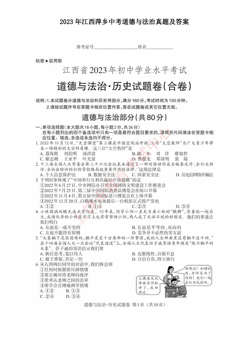 2023年江西萍乡中考道德与法治真题及答案.doc
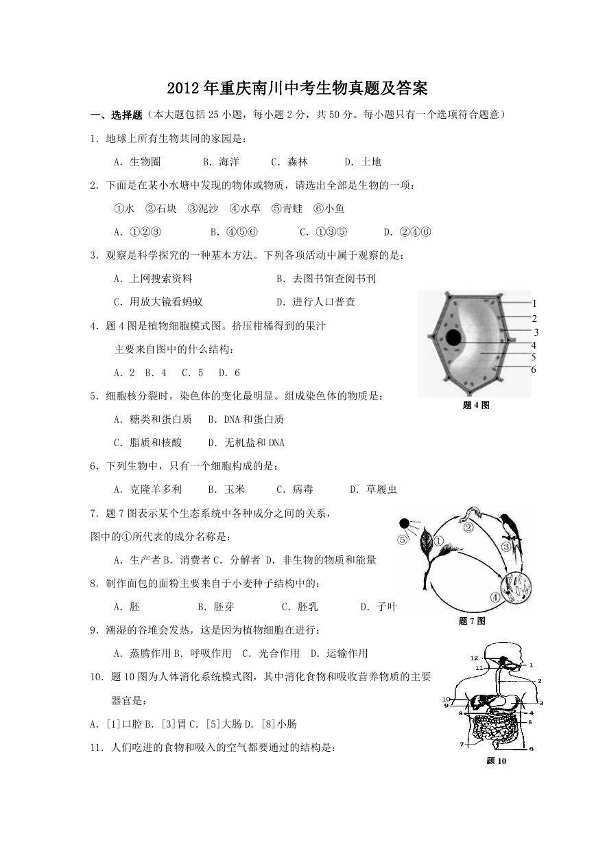 2012年重庆南川中考生物真题及答案.doc
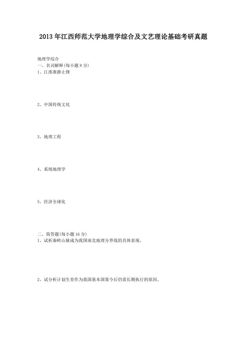 2013年江西师范大学地理学综合及文艺理论基础考研真题.doc
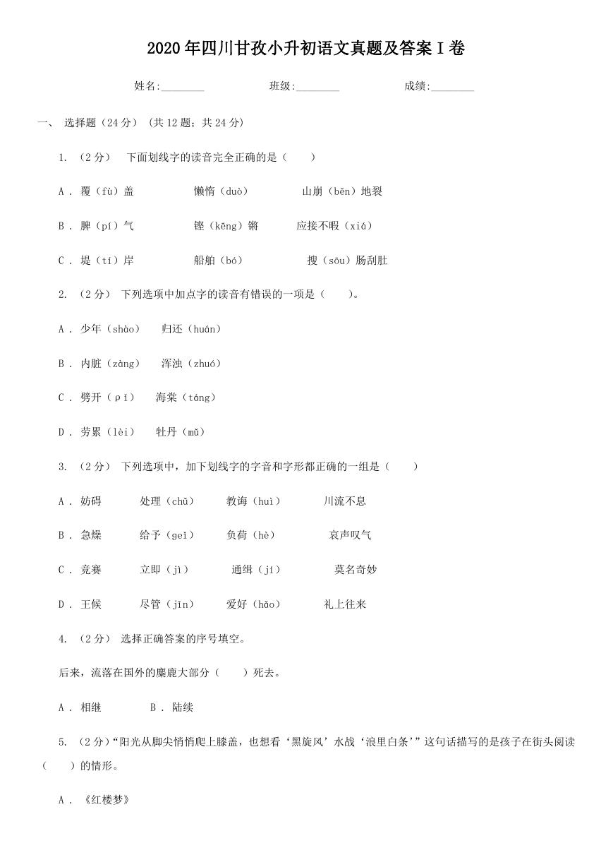 2020年四川甘孜小升初语文真题及答案I卷.doc
 2020年注册岩土工程师专业基础考试真题及答案.doc
 2023-2024学年福建省厦门市九年级上学期数学月考试题及答案.doc
 2021-2022学年辽宁省沈阳市大东区九年级上学期语文期末试题及答案.doc
 2022-2023学年北京东城区初三第一学期物理期末试卷及答案.doc
 2018上半年江西教师资格初中地理学科知识与教学能力真题及答案.doc
 2012年河北国家公务员申论考试真题及答案-省级.doc
 2020-2021学年江苏省扬州市江都区邵樊片九年级上学期数学第一次质量检测试题及答案.doc
 2022下半年黑龙江教师资格证中学综合素质真题及答案.doc
 2022-2023学年河北省唐山市高三上学期期末数学试题及答案.doc
 2022-2023学年河北省张家口市高三上学期期末数学试题及答案.doc
 2022-2023学年河北省衡水市高三上学期期末语文试题及答案.doc
 2022-2023学年河北省保定市高三上学期期末数学试题及答案.doc
 2022-2023学年河北省张家口市高三上学期期末语文试题及答案.doc
 2022-2023学年河北省石家庄市高三上学期期末语文试题及答案.doc
 2020-2021年四川省凉山州西昌市高一物理上学期期中试卷及答案.doc
 2020-2021年四川省遂宁市安居区高一英语上学期期中试卷及答案.doc
 2020-2021年四川省西昌市高一英语上学期期中试卷及答案.doc
 2021-2022年四川省广安市岳池县高一地理上学期期中试卷及答案.doc
 2021-2022年四川省成都市郫都区高一物理上学期期中试卷及答案.doc
 2021-2022年四川省广安市岳池县高一物理上学期期中试卷及答案.doc