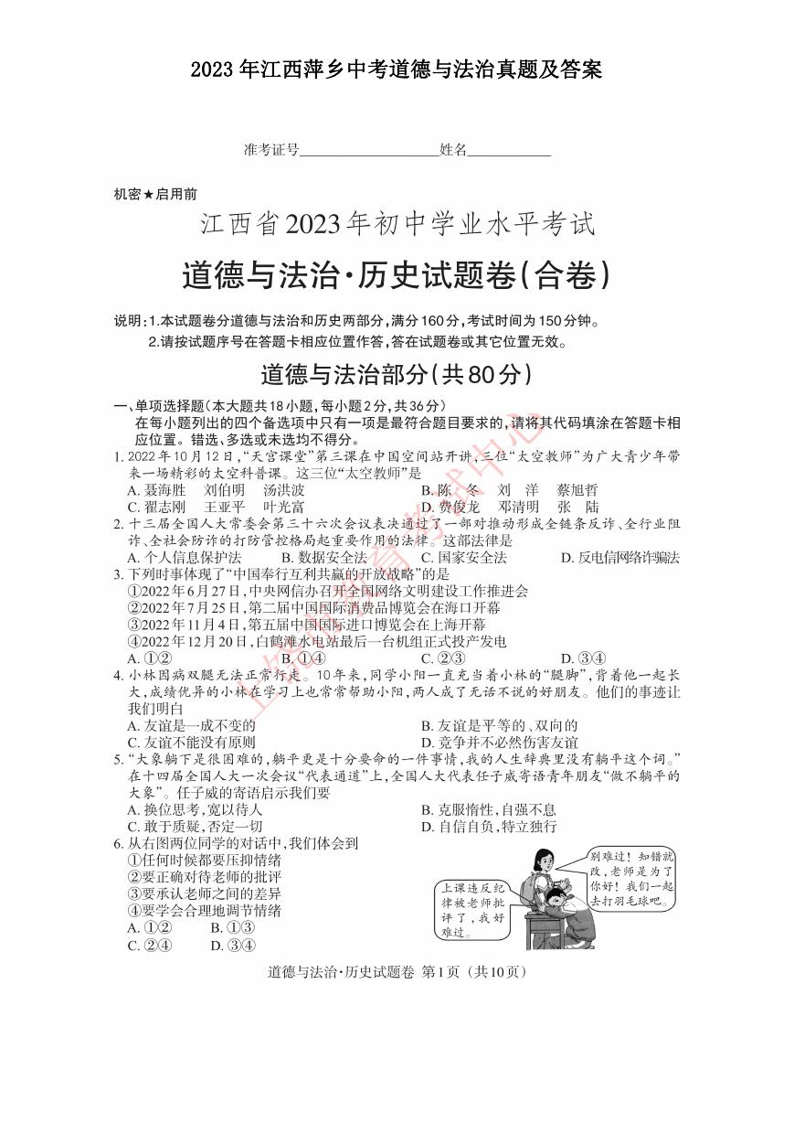
数据分析实例--美国人收入的分析(样本个数32000)
1、导入数据,完成分列
2、处理空值和异常数据,完成数据汇总
3、年龄段与收入情况关系的柱状图
4、学历与收入情况关系的柱状图
5、受教育年限与收入情况关系的折线图
6、人种与收入情况关系的饼状图
7、性别与收入情况关系的饼状图
8、初试机器学习,建立线性逻辑回归预测模型,采用新数据测试模型
In [ ]:
import pandas as pd
import os
os.getcwd()
df=pd.read_csv('adult2.txt',sep=',',header=None,names=['年龄','所有权','删除1','学历','受教育年限','婚姻'
'家庭成员','人种','性别','删除2','删除3','删除5'
In [2]:
df2=df.drop(['删除1','删除2','删除3','删除5'],axis=1).copy()
df2.columns.to_list()
for i in df2.columns.to_list():
if i=='年龄' or i=='受教育年限':
continue
print(i)
df2[i]=df2[i].str.strip()
所有权
学历
婚姻
职业
家庭成员
人种
性别
国家
收入
In [3]:
df2.loc[df2['所有权']=='?',:]
for i in df2.columns.to_list():
if i=='年龄' or i=='受教育年限':
continue
df2.loc[:,i]=df2[i].str.replace('?','Others')
df2
年
龄
0 39
1 50
所有权
学历
受
教
育
年
限
State
gov Bachelors 13
Self
emp
notinc
Bachelors 13
婚姻
职业 家庭成员 人种
性别
国家 收入
Never
married
Married
civ
spouse
Adm
clerical
Notin
family White
Male United
States <=50K
Exec
managerial
Husband White
Male United
States <=50K
2 38 Private
HSgrad
9 Divorced
3 53 Private
11th
7
4 28 Private Bachelors 13
Married
civ
spouse
Married
civ
spouse
Handlers
cleaners
Handlers
cleaners
Prof
specialty
Notin
family White
Male United
States <=50K
Husband Black
Male United
States <=50K
Wife Black Female
Cuba <=50K
In [4]:
#年龄与收入情况的关系
#将年龄进行分段处理
In [5]:
area=[-1,20,30,40,50,60,70,80,90,101]
labels=['0-20','20-30','30-40','40-50','50-60','60-70','70-80','80-90','90-100']
df2['年龄段']=pd.cut(df2['年龄'],area,right=False,labels=labels)
In [6]:
#将‘年龄段列’移动到‘年龄列’后面
In [7]:
new_columns=df2.columns.to_list()
new_columns.remove('年龄段')
new_columns.insert(new_columns.index('年龄')+1,'年龄段')
df2=df2.reindex(columns=new_columns)
In [8]:
#年龄段与收入关系的柱状图
In [28]:
X=df4.index.str.replace('..-','').str.replace('.-','').astype('int32').to_list()
X2=[i+1 for i in X]
X3=[i-1 for i in X]
Y1=df4['<=50K'].to_list()
Y2=df4['>50K'].to_list()
import matplotlib
plt.figure(figsize=(12,6),dpi=80)
matplotlib.rcParams['font.family']='STSong'
matplotlib.rcParams['font.size']=12
plt.bar(X2,Y1,facecolor='red',edgecolor='yellow',width=2,label='收入<=50K',lw=0.5)
plt.bar(X3,Y2,facecolor='blue',edgecolor='white',width=2,label='收入>50K',lw=0.5)
plt.xlabel('年龄段')
plt.ylabel('统计人数')
plt.xticks(X,df4.index.to_list())
plt.legend(loc="upper right")
for x,y in zip(X2,Y1):
plt.text(x+1.5,y+300,y,ha='center',va='top')
for x,y in zip(X3,Y2):
plt.text(x-1.5,y+300,y,ha='center',va='top')
ax=plt.gca()
ax.set_xlim(15,105)
ax.set_ylim(-10,8000)
plt.title('年龄段-收入关系柱状图')
plt.show()
In [11]:
#学历与收入关系的柱状图
In [12]:
df_xueli=df2.groupby(['学历','收入']).count()
df_xueli2=df_xueli['年龄'].unstack()
df_xueli2.index.to_list()
xueli_index=['1st-4th','5th-6th','7th-8th','9th','10th','11th','12th','Preschool','Assoc-acdm','Assoc-voc'
'Prof-school','Some-college','Bachelors','Masters','Doctorate']
df_xueli2=df_xueli2.reindex(index=xueli_index)
df_xueli2.loc[:,'>50K']=df_xueli2['>50K'].fillna(0)
df_xueli2=df_xueli2.assign(less_than_50K=lambda x : x['<=50K']/(x['<=50K']+x['>50K']),
higher_than_50K=lambda x : x['>50K']/(x['<=50K']+x['>50K']))
In [13]:
import numpy as np
X_xueli=np.arange(10,170,step=10)
X_xueli
Out[13]:
array([ 10, 20, 30, 40, 50, 60, 70, 80, 90, 100, 110, 120, 130,
140, 150, 160])
In [14]:
X2_xueli=[i+1 for i in X_xueli]
X3_xueli=[i-1 for i in X_xueli]
Y2_xueli=df_xueli2['less_than_50K'].to_list()
Y3_xueli=df_xueli2['higher_than_50K'].to_list()
plt.figure(figsize=(12,8),dpi=80)
plt.bar(X2_xueli,Y2_xueli,facecolor='red',edgecolor='yellow',width=2,label='收入<=50K',lw=0.1)
plt.bar(X3_xueli,Y3_xueli,facecolor='blue',edgecolor='white',width=2,label='收入>50K',lw=0.1)
plt.xlabel('受教育程度')
plt.ylabel('人数比例')
plt.xticks(X_xueli,df_xueli2.index.to_list(),rotation=45,size=14)
plt.legend()
for x,y in zip(X2_xueli,Y2_xueli):
plt.text(x+2,y+0.02,'%.2f'%y,ha='center',va='top')
for x,y in zip(X3_xueli,Y3_xueli):
plt.text(x-2,y+0.02,'%.2f'%y,ha='center',va='top')
ax=plt.gca()
ax.set_xlim(0,170)
ax.set_ylim(0,1.2)
plt.title('受教育程度-收入关系柱状图')
plt.show()
plt.savefig('受教育程度-收入图.png')
In [15]:
#受教育年限与收入关系的折线图
In [16]:
df_xueshi=df2.groupby(['受教育年限','收入']).count()
df_xueshi2=df_xueshi['年龄'].unstack()
df_xueshi2=df_xueshi2.fillna(0)
X_xueshi=df_xueshi2.index.to_list()
Y1_xueshi=df_xueshi2['<=50K'].to_list()
Y2_xueshi=df_xueshi2['>50K'].to_list()
In [17]:
plt.figure(figsize=(12,8),dpi=80)
plt.xlabel('受教育年限')
plt.ylabel('统计人数')
plt.xticks(X_xueshi,X_xueshi,size=14)
plt.yticks(range(0,10001,1000),range(0,10001,1000),size=14)
ax=plt.gca()
ax.set_xlim(0,17)
ax.set_ylim(0,10000)
plt.plot(X_xueshi,Y1_xueshi,'ro--',label='收入<=50K',linewidth=2)
plt.plot(X_xueshi,Y2_xueshi,'gs-',label='收入>50K',linewidth=2)
plt.legend()
plt.title('受教育年限-收入关系柱状图')
plt.savefig('受教育年限-收入图.png')
In [18]:
#人种与收入关系的饼状图
In [19]:
df_renzhong=df2.groupby(['人种','收入']).count()
df_renzhong2=df_renzhong['年龄'].unstack()
df_renzhong2
Out[19]:
收入 <=50K >50K
人种
AmerIndianEskimo
AsianPacIslander
Black
Other
White
275
763
2737
246
36
276
387
25
20699
7117


 2023年江西萍乡中考道德与法治真题及答案.doc
 2012年重庆南川中考生物真题及答案.doc
 2013年江西师范大学地理学综合及文艺理论基础考研真题.doc
 2020年四川甘孜小升初语文真题及答案I卷.doc
 2020年注册岩土工程师专业基础考试真题及答案.doc
 2023-2024学年福建省厦门市九年级上学期数学月考试题及答案.doc
 2021-2022学年辽宁省沈阳市大东区九年级上学期语文期末试题及答案.doc
 2022-2023学年北京东城区初三第一学期物理期末试卷及答案.doc
 2018上半年江西教师资格初中地理学科知识与教学能力真题及答案.doc
 2012年河北国家公务员申论考试真题及答案-省级.doc
 2020-2021学年江苏省扬州市江都区邵樊片九年级上学期数学第一次质量检测试题及答案.doc
 2022下半年黑龙江教师资格证中学综合素质真题及答案.doc
 2022-2023学年河北省唐山市高三上学期期末数学试题及答案.doc
 2022-2023学年河北省张家口市高三上学期期末数学试题及答案.doc
 2022-2023学年河北省衡水市高三上学期期末语文试题及答案.doc
 2022-2023学年河北省保定市高三上学期期末数学试题及答案.doc
 2022-2023学年河北省张家口市高三上学期期末语文试题及答案.doc
 2022-2023学年河北省石家庄市高三上学期期末语文试题及答案.doc
 2020-2021年四川省凉山州西昌市高一物理上学期期中试卷及答案.doc
 2020-2021年四川省遂宁市安居区高一英语上学期期中试卷及答案.doc
 2020-2021年四川省西昌市高一英语上学期期中试卷及答案.doc
 2021-2022年四川省广安市岳池县高一地理上学期期中试卷及答案.doc
 2021-2022年四川省成都市郫都区高一物理上学期期中试卷及答案.doc
 2021-2022年四川省广安市岳池县高一物理上学期期中试卷及答案.doc