Making
Sense of
Auto
Layout
Axel Kee
�
Frame based layout VS Auto Layout using constraint
How Auto Layout calculates view position and size
Why missing constraints appear and how to solve them
Frame based layout
Auto Layout using constraint
Example 1
Example 2
Example 3
Example 4
Homework exercise - Multiple View
Summary
Exercise Answer
3
3
7
12
13
15
18
21
25
26
27
29
33
37
Why conflicting constraint happen and how to solve them 38
41
42
44
46
47
49
51
53
55
60
61
Why it works fine on iPhone X
Why it doesn't work on iPhone SE (and also other screen width)
Fix
Summary
What is intrinsic content size and the usefulness of it
Intrinsic content size of Label
Usefulness of intrinsic content size
What is constraint priority and how to use it
Homework exercise
Summary
Example
Summary
Outro
�2
�
Frame based layout VS Auto
Layout using constraint
This is the first part of Making Sense of Auto Layout Series.
Before we dive into Auto Layout, lets look at how User Interface is
designed prior to Apple inventing Auto Layout concept.
Frame based layout
In the early days of iOS development, developing UI for iOS app is pretty
straightforward as there is only one screen size (From the first iPhone
until iPhone 4s, their screen resolution is 320x480). In 2010 Apple
introduced the iPad (resolution is 1024x768) , it was still manageable at
this point, most developer just develop two separate UI (or app), one for
iPhone and another for iPad.
In this era, frame based layout is used. Frame based layout uses a
coordinate system like this :
�3
�
Coordinate system in iOS starts from top left and ends at bottom right.
The top left coordinate is (0, 0) , which mean the horizontal (x) position is
0 and vertical (y) position is 0. For this example we used iPhone SE which
have a point resolution of 320pt x 568 pt, so the bottom right coordinate
is (320, 568), x position is 320 and y position is 568. The center point is
(320 / 2 , 568 / 2) = (160, 284).
We can create a UIView and define its x, y, width and height like this :
�4
�
let blueView = UIView(frame: CGRect(x: 80.0, y: 244.0,
width: 160.0, height: 80.0))
blueView.backgroundColor = UIColor.blue
self.view.addSubview(blueView)
This will put a blue rectangle in X position of 80 (from left), Y position of
244 (from top) and a width of 160 and height of 80. Like this :
�5
�
I have pre-calculated the position so that the rectangle is placed in the
center of the view (horizontally and vertically). It is centered nicely in
iPhone SE, but when you view it on iPhone 8 Plus, it is positioned upper
left from the center because the iPhone 8 Plus screen width and height is
larger than iPhone SE, like this :
To accommodate for iPhone 8 plus screen, you have to adjust the x,y
position of the view to get it to the center of the screen. Without using
Auto Layout constraint, the code might look like this :
�6
�
// Don't do this! This serve as a bad example
if(screenSize == iPhoneSE){
blueView.frame = CGRect(x: 80.0, y: 244.0, width:
160.0, height: 80.0)
} else if (screenSize == iPhone8){
blueView.frame = CGRect(x: 100.0, y: 284.0, width:
160.0, height: 80.0)
} else if (screenSize == iPhone8Plus){
....
} // Apple suddenly launch iPhone X
else if (screenSize == iPhoneX){
// ffuuuu...
}
// what if user rotate the screen?!
To solve this problem, Apple has introduced Auto Layout with constraint
based approach so you wouldn't have to purposely accommodate each
screen size differently.
Auto Layout using constraint
Things start to get complicated after iPhone 5 is released, then iPhone 6
and 6 plus... and then iPhone X , its certainly possible to design multiple
UI layout to fit each of them, but its a pain in the ass to do so. In my
previous work, I inherited a project that has a storyboard for each of the
iphone screen size (iPhone4s.storyboard , iPhone5.storyboard,
iPhone6.storyboard and iPhone6plus.storyboard) , it was a nightmare (kill
me) and I spent days to refactor them to use Auto Layout.
Auto Layout is a concept which the size and position of all the views in
the view hierarchy are dynamically calculated on run time, based on
constraints placed on those views.
For easier understanding, lets call the thing that will dynamically
calculates the size and position of all the views as Auto Layout Engine.
�7
�
Following the previous example shown in frame based layout, to position
the blue rectangle to center horizontally and vertically using Auto Layout,
we add constraints to the blue view in Interface Builder / Storyboard like
this :
�8
�


 2023年江西萍乡中考道德与法治真题及答案.doc
 2012年重庆南川中考生物真题及答案.doc
 2013年江西师范大学地理学综合及文艺理论基础考研真题.doc
 2020年四川甘孜小升初语文真题及答案I卷.doc
 2020年注册岩土工程师专业基础考试真题及答案.doc
 2023-2024学年福建省厦门市九年级上学期数学月考试题及答案.doc
 2021-2022学年辽宁省沈阳市大东区九年级上学期语文期末试题及答案.doc
 2022-2023学年北京东城区初三第一学期物理期末试卷及答案.doc
 2018上半年江西教师资格初中地理学科知识与教学能力真题及答案.doc
 2012年河北国家公务员申论考试真题及答案-省级.doc
 2020-2021学年江苏省扬州市江都区邵樊片九年级上学期数学第一次质量检测试题及答案.doc
 2022下半年黑龙江教师资格证中学综合素质真题及答案.doc
 2022-2023学年河北省唐山市高三上学期期末数学试题及答案.doc
 2022-2023学年河北省张家口市高三上学期期末数学试题及答案.doc
 2022-2023学年河北省衡水市高三上学期期末语文试题及答案.doc
 2022-2023学年河北省保定市高三上学期期末数学试题及答案.doc
 2022-2023学年河北省张家口市高三上学期期末语文试题及答案.doc
 2022-2023学年河北省石家庄市高三上学期期末语文试题及答案.doc
 2020-2021年四川省凉山州西昌市高一物理上学期期中试卷及答案.doc
 2020-2021年四川省遂宁市安居区高一英语上学期期中试卷及答案.doc
 2020-2021年四川省西昌市高一英语上学期期中试卷及答案.doc
 2021-2022年四川省广安市岳池县高一地理上学期期中试卷及答案.doc
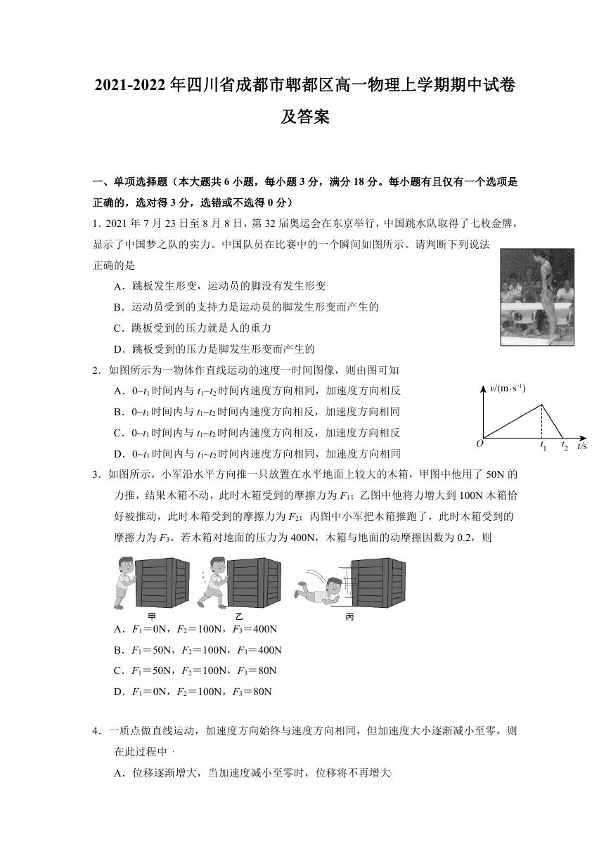 2021-2022年四川省成都市郫都区高一物理上学期期中试卷及答案.doc
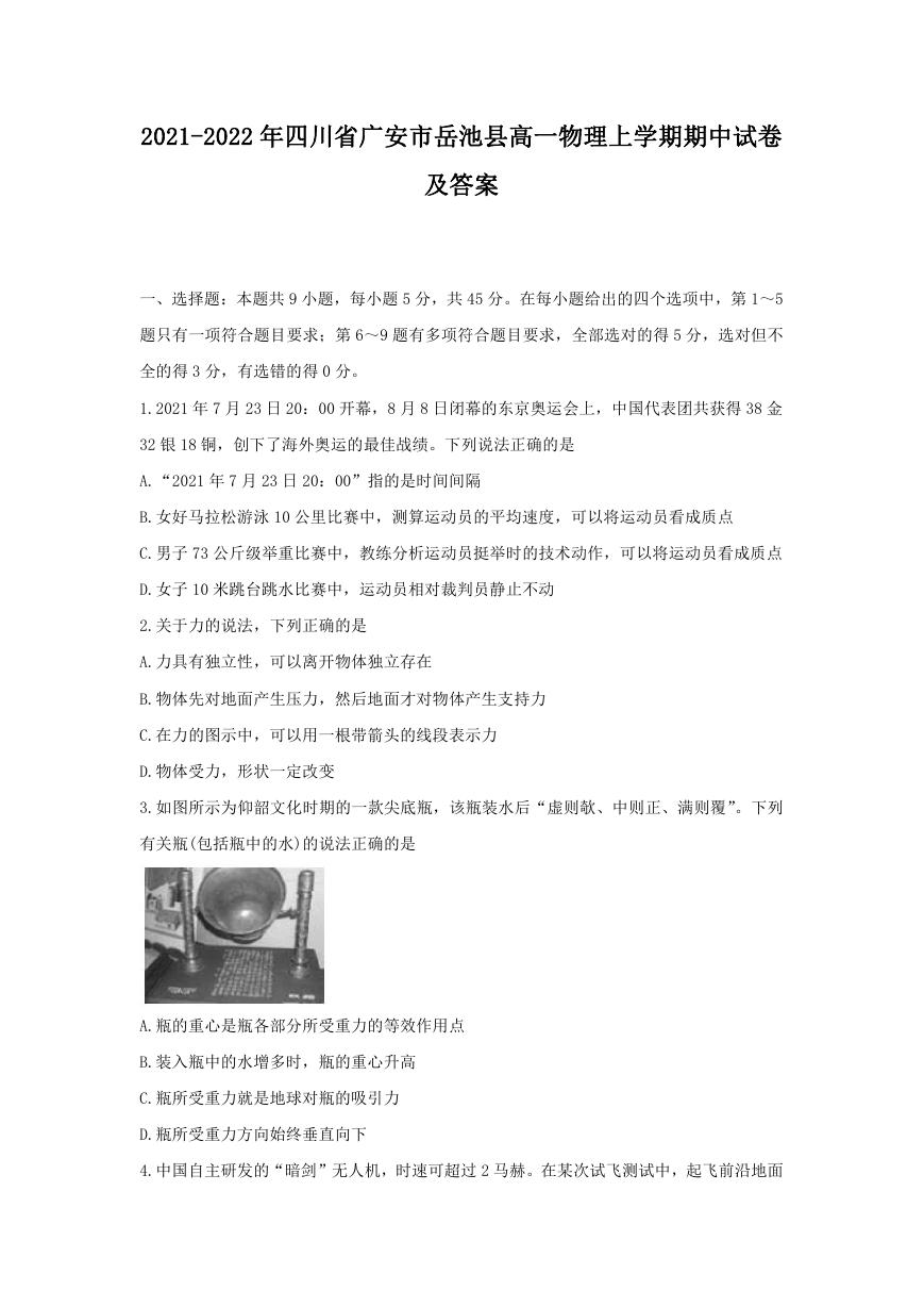 2021-2022年四川省广安市岳池县高一物理上学期期中试卷及答案.doc