

第1页 / 共4页

第2页 / 共4页

第3页 / 共4页

第4页 / 共4页
他是一位白手起家事业成功的亿万富翁,是当今最成功的世界级潜能开发专家;他协助职业球队、企业总裁、国家元首激发潜能,渡过各种 困境及低潮。曾辅导过多位皇室的家庭成员,被美国前总统克林顿、戴安娜王妃聘为个人顾问;曾为众多世界名人提供咨询,包括南非总统曼徳 拉、前苏联总统戈尔巴乔夫、世界网球冠军安德烈•阿加西等;
 2023年江西萍乡中考道德与法治真题及答案.doc
 2012年重庆南川中考生物真题及答案.doc
 2013年江西师范大学地理学综合及文艺理论基础考研真题.doc
 2020年四川甘孜小升初语文真题及答案I卷.doc
 2020年注册岩土工程师专业基础考试真题及答案.doc
 2023-2024学年福建省厦门市九年级上学期数学月考试题及答案.doc
 2021-2022学年辽宁省沈阳市大东区九年级上学期语文期末试题及答案.doc
 2022-2023学年北京东城区初三第一学期物理期末试卷及答案.doc
 2018上半年江西教师资格初中地理学科知识与教学能力真题及答案.doc
 2012年河北国家公务员申论考试真题及答案-省级.doc
 2020-2021学年江苏省扬州市江都区邵樊片九年级上学期数学第一次质量检测试题及答案.doc
 2022下半年黑龙江教师资格证中学综合素质真题及答案.doc
 2022-2023学年河北省唐山市高三上学期期末数学试题及答案.doc
 2022-2023学年河北省张家口市高三上学期期末数学试题及答案.doc
 2022-2023学年河北省衡水市高三上学期期末语文试题及答案.doc
 2022-2023学年河北省保定市高三上学期期末数学试题及答案.doc
 2022-2023学年河北省张家口市高三上学期期末语文试题及答案.doc
 2022-2023学年河北省石家庄市高三上学期期末语文试题及答案.doc
 2020-2021年四川省凉山州西昌市高一物理上学期期中试卷及答案.doc
 2020-2021年四川省遂宁市安居区高一英语上学期期中试卷及答案.doc
 2020-2021年四川省西昌市高一英语上学期期中试卷及答案.doc
 2021-2022年四川省广安市岳池县高一地理上学期期中试卷及答案.doc
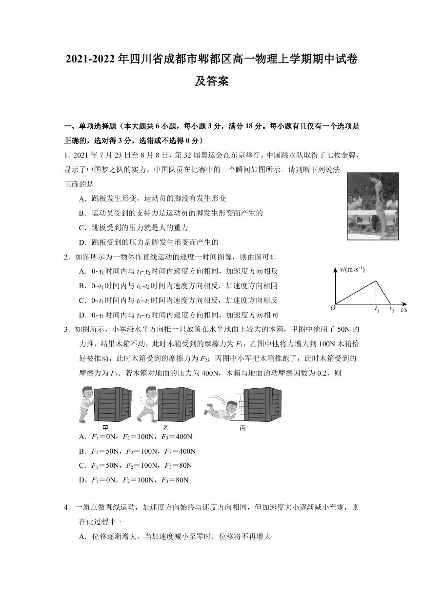 2021-2022年四川省成都市郫都区高一物理上学期期中试卷及答案.doc
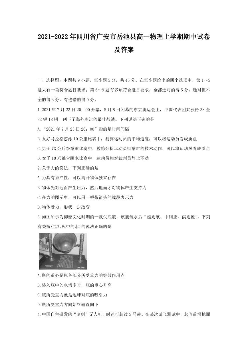 2021-2022年四川省广安市岳池县高一物理上学期期中试卷及答案.doc