目录
译者: boo
校对: f
序言
0.1. 这本书的历史
0.2. 你应该已经知道的
0.3. 本书有些什么
0.4. 阅读顺序
译者:cnhackTNT
0.5. 排版约定
译者:cnhackTNT
0.6. 我们希望听到你的意见与建议
译者:cnhackTNT
0.7. 感谢
译者:cnhackTNT
0.7.1. 史蒂夫
0.7.2. 南希
第一章 你好,Perl/Tk
译者:盛春
目录
1.1. Perl/Tk 的概念
译者:gu
1.2. 一些 Perl/Tk 的历史
1.2.1. X Window 系统和 Xlib 库
1.2.2. Tcl/Tk 的产生
1.2.3. Perl/Tk 的演变
图 1-1. Hello, Perl/Tk
1.2.4. 当 Perl/Tk 遭遇 Win32
在 Win32 平台上运行 Perl/Tk 程序
译者:gu
1.3. Perl/Tk 起步
1.3.1. 你需要安装每一样东西吗?
Perl/Tk 版本
1.3.2. 创建组件
1.3.3. 指定选项
1.3.4. Toplevel, MainWindow, and Frame Widgets
1.3.5. Displaying a Widget
1.3.6. The Event Loop
译者:gu
1.4. Hello World 的例子
图例 1-2. Hello World 窗口
1.4.1. 相对于 destroy 的 exit
译者:boob
1.5. 一些额外的建议
1.5.1. 程序设计风格
1.5.2. 组件类型命名约定
表 1-1. 组件类型的命名约定
1.5.3. 设计你的窗体
译者:boob
1.6. 调试和原型化设计 Perl/Tk 程序
图 1-3. ptksh session
图 1-4. ptkdb session
第二章 布局管理器
目录
图 2-1. 窗体及其内部的 Frame ,分别使用了不同的布局管理器
2.1. pack 管理器
图 2-2. 重叠错误
图 2-3. 使用 pack 来管理布局的窗口
图 2-4. 使用附带额外参数的 pack 来管理布局的窗口
2.1.1. pack 的选项
2.1.2. 设置组件位置
图 2-5. 安置一个按钮到不同的方向
图 2-6. 使用默认设置来安置的四个按钮组件
2.1.3. 矩形分配区域
图 2-7. 使用 -side => 'top' 和 -side => 'left' 所形成的矩形分
图 2-8.使用默认-side 选项"top"所形成的矩形分配区域
图 2-9. 四个按钮的矩形分配区域
图 2-10.四个按钮放置在窗体的不同方向
2.1.4. 填充矩形分配区域
图 2-11. 四个按钮被设置为-fill=>'both'
图 2-12. 四个按钮-fill选项被取值为'both',且以左,右,上,下顺序安置.
图 2-13. 四个按钮安置顺序为上,右,下,左.
2.1.5. 扩展矩形区域
图 2-14. 四个按钮都设置为 -expand => 1 和 -fill => 'both'
图 2-15. 四个按钮被设置为-expand => 1 and -fill => 'none'
2.1.6. 固定矩形分配区域中的组件
图2-16. -anchor选项取值在矩形分配区域中的指向
图 2-17. -expand选项设为'1'后组件在默认-anchor为'center'下的布局
图 2-18. 在 -anchor => 'e' 和 -anchor => 'w'情况下的两个例子(
图 2-19. 按钮设置为 -side => 'top', -anchor => 'w'的窗体布局
图 2-20. 按钮设置为-side => 'left', -anchor => 'n'的窗体布局
2.1.7. 组件在窗体中的安置顺序
图 2-21. 右边是Done4按钮被设置为 -after => $widget1情况下的窗体布局
图 2-22. Done4按钮设置为 -before => $done1情况下的窗体布局
2.1.8. 扩展组件的大小
图 2-23. 设置为-ipadx => 10, -ipady => 10的按钮Done1 在窗体中
Figure 2-24. The Done1 Button was created with opt
2.1.8.1. 有效 screen distances值
表 2-1. 有效的screen distances值
2.1.9. 安置组件于非默认的父组件
2.1.10. 与pack布局管理器相关的一些组件对象方法
2.1.10.1. 释放组件
2.1.10.2. 寻回组件布局信息
2.1.10.3. 限制窗体自适应大小
2.1.10.4. 获得子组件列表
图 2-25. 在 Enlarge 按钮被按下之前的窗体
图 2-26. Enlarge 按钮被按下后的窗体
2.1.11. 关于 pack 的几个小程序
图 2-27. 测试程序运行后的控制台窗口和显示窗口
图 2-28. 可以测试更多pack选项的控制台窗口
2.2. The grid Geometry Manager
Figure 2-29. A window divided into grids
2.2.1. Special Characters
2.2.1.1. Spanning columns
Figure 2-30. Example of column spanning using the
2.2.1.2. Empty cells
Figure 2-31. Leaving an empty cell between widgets
2.2.2. grid Options
2.2.3. Specifying Rows and Columns Explicitly
2.2.4. Spanning Rows and Columns Explicitly
Figure 2-32. Nonexplicit -columnspan example
Figure 2-33. Explicit -rowspan example
2.2.5. Forcing a Widget to Fill a Cell
2.2.6. Padding the Widget
Figure 2-34. grid -ipadx and -ipady example
Figure 2-35. grid -padx and -pady example
2.2.7. Specifying a Different Parent
2.2.8. Configuring Columns and Rows
2.2.8.1. Weight
Figure 2-36. gridRowconfigure and gridColumnconfig
2.2.8.2. Minimum cell size
2.2.8.3. Padding
2.2.8.4. Bounding box
2.2.9. Removing a Widget
2.2.10. Getting Information
2.2.11. Widget Location
2.2.11.1. Propagation
2.2.12. How Many Columns and Rows?
2.2.13. gridSlaves
2.3. The place Geometry Manager
2.3.1. place Options
2.3.2. Absolute Coordinates
Figure 2-37. Coordinate system of parent window wh
Figure 2-38. Button placed using -x => 0, -y => 0
Figure 2-39. Overlapping Buttons using place
2.3.3. Relative Coordinates
Figure 2-40. The relative coordinate system
Figure 2-41. Using place with -relx => 0.5, -rely
Figure 2-42. -relx => 0.5, -rely => 0.5 window res
Figure 2-43. Two Buttons placed relative to the pa
2.3.4. Anchoring the Widget
Figure 2-44. Different -anchor values affect where
2.3.5. Width and Height
Figure 2-45. Using -width with place
Figure 2-46. Example of the same window resized wi
2.3.6. Border Options
Figure 2-47. -bordermode examples
2.3.7. Methods Associated with place
2.3.7.1. Removing the widget
2.3.7.2. Place information
2.3.7.3. Place slaves
.4. The form Geometry Manager
2.4.1. Options for form
2.4.2. Attachments
2.4.2.1. Attaching to the grid
Figure 2-48. How the form grid works (both windows
Figure 2-49. A widget attached to the grid on two
2.4.2.2. Widget-to-widget attachments
Figure 2-50. Using an offset with a widget attachm
Figure 2-51. Using same-side and opposite-side att
Figure 2-52. Stretching widgets to the same point
2.4.2.3. Attaching to nothing
2.4.3. Springs
Figure 2-53. Using the Play with form program to t
2.4.4. form Methods
2.4.4.1. Changing the grid size
2.4.4.2. Removing a widget from a container
2.4.4.3. Options info for form
2.4.4.4. What's managed by form?
2.4.4.5. Circular dependency check
2.5. Geometry Management Summary
翻译:boob
第三章. 字体
内容:
3.1. 字体实验
图 3-1. Font viewer
翻译:boob
3.2. 剖析字体
翻译:boob
3.3. 使用字体
3.3.1. 系统字体
表 3-1. 系统字体
·Ò룺b
3.4. 使用动态字体
图 3-2. 这是我们的 Font viewer 的主窗口,它的样式是个控制面板。
图 3-3. 这是一个出现在顶层的独立的字体(Courier)查看窗口。
翻译:boob
3.5. 字体处理方法
3.5.1. 最后一个例子
图 3-4. Banner 程序显示的字体配置组件
图 3-5. Banner 程序隐藏了字体配置组件
第四章. 简单按钮 Button, 多选按钮 Checkbutton, 和单选按钮 Radiobut
翻译:ts
内容:
图例 4-1. 按钮组件
图例 4-2. 多选按钮组件
图例 4-3. 单选按钮组件
图例 4-4. 在购物单列表中使用多选按钮
图例 4-5. 单选按钮 Radiobuttons
4.1. 创建一个按钮组件
4.2. 每一按钮类型的标准选项
4.3. 按钮类组件的选项列表
Table 4-1. Options for Button-type widgets
4.4. 在按钮上显示文本
Figure 4-6. Example of using -textvariable
4.5. 显示图像或位图
Figure 4-7. Window showing all the default bitmaps
Figure 4-8. Button with an image instead of text
4.5.1. Images with Checkbuttons and Radiobuttons
Figure 4-9. Using both -image and -selectimage
Figure 4-10. Using Checkbuttons and Radiobuttons w
4.6. Checkbutton and Radiobutton Indicator Status
Figure 4-11. Buttons changing the value of a Check
4.7. On and Off Values for a Checkbutton
4.8. Radiobutton Values
Figure 4-12. Radiobuttons that change the backgrou
4.9. The -command Option
Figure 4-13. Checkbutton that will display other w
Figure 4-14. Window after clicking the Checkbutton
4.10. Disabling a Button
Figure 4-15. Window with disabled Button (Exit) an
4.11. Text Manipulation
Figure 4-16. Buttons with various fonts
Figure 4-17. Effects of -justify and -wraplength i
Figure 4-18. Anchor points within a Button
Figure 4-19. Anchor on Button set to 'nw'
4.12. Altering the Button's Style
Figure 4-20. Different relief types for a Button
Figure 4-21. Different relief types for a Checkbut
Figure 4-22. Different relief types for a Radiobut
Figure 4-23. Different relief types for a Button w
Figure 4-24. Checkbuttons with -borderwidth => 4
Figure 4-25. Checkbuttons with -borderwidth => 10
Figure 4-26. Radiobuttons with -borderwidth => 4
Figure 4-27. Radiobuttons with -borderwidth => 10
4.13. Changing the Size of a Button
Figure 4-28. Default -width and -height (left) ver
Figure 4-29. A bitmap displayed three times, with
Figure 4-30. Default width and height (left) versu
4.14. Adding a Keyboard Mapping
Figure 4-31. Example of -underline => 1
4.15. Color Options
Figure 4-32. Example of -background => 'blue'
Figure 4-33. Example of -background => 'blue' and
Figure 4-34. 'error' bitmap with -foreground => 'w
Figure 4-35. -disabledforeground example
4.16. Indicator Colors
4.17. Hiding the Indicator
Figure 4-36. Unchecked (left) and checked (right)
4.18. Focus Options
Figure 4-37. The first Button has the input focus
4.19. Altering the Highlight Rectangle
Figure 4-38. Example of -highlightthickness => 10
Figure 4-39. Example of Button with -highlightcolo
Figure 4-40. Button with -highlightcolor => 'blue'
4.20. 配置一个按钮
4.21. Flashing the Button
4.22. Invoking the Button
4.23. Turning a Checkbutton/Radiobutton On and Off
Chapter 5. Label and Entry Widgets
Contents:
5.1. The Label Widget
Figure 5-1. Label widget
Figure 5-2. A simple window with Label and Button
5.1.1. Creating a Label
5.1.2. Label Options
5.1.3. How a Label Differs from Other Widgets
5.1.4. Relief
Figure 5-3. Labels with different relief values; w
5.1.5. Status Message Example
Figure 5-4. Window with Label across the bottom
5.1.6. Container Frames
5.1.7. Label Configuration
5.2. The Entry Widget
Figure 5-5. Entry widget
5.2.1. Creating the Entry Widget
5.2.2. Entry Options
5.2.3. Assigning the Entry's Contents to a Variabl
5.2.4. Relief
Figure 5-6. Different relief types for an Entry wi
5.2.5. Entry Indexes
5.2.6. Text Selection Options
Figure 5-7. Entry with -selectbackground => 'red'
Figure 5-8. Entry widget with -selectborderwidth =
5.2.7. The Insert Cursor
Figure 5-9. Default insertion cursor
Figure 5-10. Insertion cursor with -insertbackgrou
Figure 5-11. -insertborderwidth => 5, -insertbackg
5.2.8. Password Entries
Figure 5-12. Entry displaying a password
5.2.9. Entry Widget Validation
5.2.10. Using a Scrollbar
Figure 5-13. Scrollbar and an Entry widget
5.2.11. Configuring an Entry Widget
5.2.12. Deleting Text
5.2.13. Getting the Contents of an Entry Widget
5.2.14. Moving the Insertion Cursor
5.2.15. Getting a Numeric Index Value
5.2.16. Inserting Text
Figure 5-14. Using the insert method
5.2.17. Scanning Text
5.2.18. Working with the Selection
5.2.19. Changing the View in the Entry Widget
Figure 5-15. What $left and $right mean
5.3. The Perl/Tk LabEntry Mega-Widget
Chapter 6. The Scrollbar Widget
Contents:
6.1. Defining Scrollbar Parts
Figure 6-1. Different parts of a Scrollbar
Figure 6-2. Entry widget with a Scrollbar
Figure 6-3. Listbox widget with Scrollbar
Figure 6-4. Text widget displaying Scrollbar.pm fi
Figure 6-5. Canvas widget with Scrollbars
6.2. The Scrolled Method
6.2.1. Configuring the Scrollbar(s) Created with S
6.3. The Scrollbar Widget
Figure 6-6. Scrollbar widget
6.3.1. Creating a Scrollbar Widget
6.3.2. Scrollbar Options
6.3.3. Scrollbar Colors
Figure 6-7. Scrollbar with -troughcolor set to 'gr
Figure 6-8. Examples of -background option
6.3.4. Scrollbar Style
Figure 6-9. Different relief values; second row re
Figure 6-10. Example of -elementborderwidth set to
Figure 6-11. Top Scrollbar has width of 15 (defaul
6.3.5. Scrollbar Orientation
6.3.6. Using the Arrows and the Slider
6.3.7. Assigning a Callback
6.3.8. How the Scrollbar Communicates with Other W
6.3.9. Scrollbar Configuration
6.3.10. Defining What We Can See
Figure 6-12. View of data through widget by set me
6.3.11. Getting the Current View
6.3.12. Activating Elements in a Scrollbar
6.3.13. Calculating Change from Pixels
6.3.14. Locating a Point in the Trough
Figure 6-13. Example of values returned by the fra
6.3.15. Identifying Elements
6.4. Examples
6.4.1. Entry Widget
Figure 6-14. Entry widget with a Scrollbar
6.4.2. Listbox, Text, and Canvas Widgets
Figure 6-15. A Listbox with two Scrollbars
6.4.3. One Scrollbar, Multiple Widgets
Figure 6-16. A window with three Listboxes all con
第七章. Listbox 组件
译者:cnhackTNT
内容:
图 7-1. Listbox 组件
7.1. Creating and Filling a Listbox
7.2. Listbox Options
7.3. Selection Modes
7.3.1. Operating System Differences
7.4. Colors
Figure 7-2. Examples of -foreground, -background,
7.5. Listbox Style
Figure 7-3. Examples of -relief and -borderwidth i
7.5.1. Style of Selected Items
Figure 7-4. Example of -selectborderwidth => 4
Listbox Indexes
7.5.2. Special Listbox Resizing
7.6. Configuring a Listbox
7.7. Inserting Items
7.8. Deleting Items
7.9. Retrieving Elements
7.10. Selection Methods
7.10.1. Selecting Items
7.10.2. Unselecting Items
7.10.3. Testing for Selection
7.10.4. Anchoring the Selection
7.11. Moving to a Specific Index
7.12. Translating Indexes
7.13. Counting Items
7.14. Active Versus Selected
Figure 7-5. Windows showing a Listbox with an "act
7.15. Bounding Box
Figure 7-6. Bounding box values around text
7.16. Finding an Index by y Coordinate
7.17. Scrolling Methods
7.18. Listbox Virtual Events
7.19. Listbox Example
Chapter 8. The Text, TextUndo, and ROText Widgets
Contents:
8.1. Creating and Using a Text Widget
8.2. Text Widget Options
8.2.1. Fonts
Figure 8-1. Text widget using -font => "r16"
8.2.2. Widget Size
8.2.3. Widget Style
Figure 8-2. Text widgets showing different -relief
8.2.4. Line Spacing
Figure 8-3. Example of -spacingN options
8.2.5. Tab Stops
8.3. A Short Break for a Simple Example
sub save_file {8.4. Text Indexes
8.4.1. Base Index Values
8.4.2. Index Modifiers
8.4.3. Text Index Examples
8.5. Text Tags
8.5.1. Tag Options
8.5.2. A Simple Tag Example
Figure 8-4. Text widget with normal and bold text
8.5.3. Selections in a Text Widget Using the "sel"
8.5.4. Configuring and Creating Tags
8.5.5. Adding a Tag to Existing Text
8.5.6. Using bind with Tags
8.5.6.1. The Perl/Tk Text widget extended bindings
8.5.7. Deleting All Instances of a Tag
8.5.8. Removing a Tag from the Text
8.5.9. Raising and Lowering Tags
8.5.10. Getting Tag Names
8.5.11. Determining Where a Tag Applies
8.6. Inserting Text
8.6.1. Inserting Lines Using print and printf
Figure 8-5. Lines inserted via print and printf
8.7. Deleting Text
8.8. Retrieving Text
8.9. Translating Index Values
8.10. Comparing Index Values
8.11. Showing an Index
8.12. Getting the Size of a Character
8.13. Getting Line Information
8.14. Searching the Contents of a Text Widget
Search Options
8.15. Scrolling
8.16. Marks
8.16.1. Setting and Getting the Gravity
8.16.2. Determining Mark Names
8.16.3. Creating and Deleting Marks
8.17. Embedding Widgets
Figure 8-6. Text widget containing other widgets
8.17.1. windowCreate, windowCget, and windowConfig
8.17. Embedding Widgets
Figure 8-6. Text widget containing other widgets
8.17.1. windowCreate, windowCget, and windowConfig
8.18. Internal Debug Flag
8.18.1. Scanning
8.19. The Perl/Tk Text Widget Extended Methods
Figure 8-7. Built-in Menu
8.20. The TextUndo Widget
8.20.1. TextUndo Virtual Events
8.21. The ROText Widget
第九章 画布组件
译者: Jes
目录:
图例9-1 画布组件
9.1. 创建画布
译者: Jes
9.2. 画布中的坐标体系
图例9-2 画布组件的坐标体系
译者: Jes
9.3. 可以滚动的区域
图例9-3. 画布组件中的“可见区域”和“可滚动区域”的比较
译者: Jes
9.4. 在画布中使用绑定
译者: Jes
9.5. 画布的配置选项
9.5.1. Common Canvas Dash, Stipple, and Tile Optio
9.5.2. Additional Scrolling Options
9.5.3. Canvas Widget Option List
9.6. Creating Items in a Canvas
9.6.1. The Arc Item
9.6.2. The Bitmap Item
9.6.3. The Image Item
9.6.4. The Line Item
Figure 9-4. Definition of arrowhead
9.6.5. The Oval Item
9.6.6. The Polygon Item
9.6.7. The Rectangle Item
9.6.8. The Text Item
9.6.8.1. Text item indexes
9.6.8.2. Deleting characters
9.6.8.3. Positioning the cursor
9.6.8.4. Index information
9.6.8.5. Adding text
9.6.8.6. Selecting text
9.6.9. The Widget Item
9.6.10. The Grid Item
Figure 9-5. A canvas with three grid items
9.6.11. The Group Item
Figure 9-6. Before move
Figure 9-7. After move
9.7. Configuring the Canvas Widget
9.8. Configuring Items in the Canvas Widget
9.9. Tags
9.9.1. Binding Items Using Tags
9.9.2. Finding Tags
9.9.3. Getting Tags from a Specific Item
9.10. Retrieving Bounding Box Coordinates
9.11. Translating Coordinates
9.12. Moving Items Around
9.13. Changing the Display List
9.14. Deleting Items
9.15. Deleting Tags
9.16. Determining Item Type
9.17. Setting Keyboard Focus
9.18. Rendering the Canvas as PostScript
9.19. Scaling the Canvas
9.20. Scanning
9.20.1. Scrolling Methods
9.21. A Drawing Program Example
Figure 9-8. Quick Draw application screen
Chapter 10. The Scale Widget
Contents:
Figure 10-1. Scale widget
10.1. Creating a Scale
10.2. Assigning a Callback
10.3. Orientation
Figure 10-2. Vertical Scale (the default orientati
10.4. Minimum and Maximum Values
10.5. Displayed Versus Stored Value
10.6. Adding a Label
Figure 10-3. Two Scales with labels
10.7. Displaying Value Increments
Figure 10-4. Using -tickinterval with both horizon
10.8. Changing the Size of the Scale
Figure 10-5. Different -sliderlength values
10.9. Options You'll Probably Never Need
10.10. Configuring a Scale
10.11. Getting the Value of a Scale
10.12. Setting the Value of a Scale
10.13. Determining Coordinates
10.14. Identifying Parts of a Scale
Chapter 11. Frame, MainWindow, and Toplevel Widget
Contents:
11.1. Creating a Frame
11.2. Creating a Toplevel Widget
11.3. Options
11.3.1. Frame-Specific Options
11.3.2. Toplevel-Specific Options
11.3.3. Viewing a Frame
Figure 11-1. Different relief values for Frames; -
11.3.4. Adding a Label to a Frame
Figure 11-2. Frame with label in default position
11.3.5. Frames Aren't Interactive
11.3.6. Colormap Complications
11.3.7. The Magical Class Option
11.4. Frame Methods
11.5. Toplevel Methods
11.5.1. Sizing a Toplevel
11.5.2. Maximum Size
11.5.3. Minimum Size
11.5.4. Limiting Resizing
11.5.5. Using a Size Aspect
11.5.6. Setting the Title
11.5.7. Showing the Toplevel
11.5.8. Withdrawing the Toplevel
11.5.9. Iconifying the Toplevel
11.5.10. Specifying the Icon Bitmap
11.5.11. Specifying the Icon Mask
11.5.12. Setting the Name of the Icon
11.5.13. Setting the Icon Position
11.5.14. Using a Window Instead of an Icon
11.5.15. Determining the State
11.5.16. Assigning a Client Name
11.5.17. Window Properties
11.5.18. The Colormap Property
11.5.19. The Command Property
11.5.20. The Focus Model
11.5.21. Getting a Widget's Window ID
11.5.22. The Application Grid
11.5.23. Being the Leader
11.5.24. Removing Decorations
11.5.25. Who Placed the Window?
11.5.26. Who Sized It?
11.5.27. Transient Windows
11.6. Creating Multiple MainWindows
Figure 11-3. Wallace phoning Gromit
11.7. Putting Two MainWindows to Work
Figure 11-4. Gromit replying to a phone call from
Figure 11-5. How perldoc might render tkphone's PO
翻译: fa
目录:
12.1. 菜单体系的组成部件
12.1.1. 菜单和菜单项
图 12-1. 菜单体系的重要部件
12.1.2. 菜单索引
12.1.3. 操作菜单
12.1.4. 操作菜单项
12.1.5. 菜单栏
图 12-2. 比较这张在 Win32 上产生的图片和 Unix 下的
12.1.6. 菜单组件选项
翻译: fa
12.2. 菜单栏和下拉式菜单
12.2.1. 笨拙的、非正式的、旧式的风格的菜单栏
12.2.2. 灵活的、久经考验的、新式的风格的菜单栏
翻译: fa
12.3. Win32 下的菜单项
图 12-3. 显示一个排序 dir 命令的系统菜单项
图 12-4. 单击 "dir | sort | more" 系统菜单按钮的显示结果
翻译: fa
12.4. 经典式菜单栏
12.4.1. 菜单按钮选项
12.4.2. 只对按钮有效的选项
翻译: fa
12.5. 弹出式菜单
12.5.1. post 和 Post 方法
图 12-5. Post 弹出一个菜单且激活一菜单项(在此为 index 4)
12.5.2. Popup 方法
Figure 12-6. Popup 为 Tk::Wm 的一个方法
图 12-7. 两个锚位置定义了 popup locus
12.5.2.1. 弹出菜单的例子
翻译: fa
12.6. 选项式菜单
12.6.1. Tk::Optionmenu
图 12-8. Tk::Optionmenu 组件被限制在一列中
12.6.2. 本地化选项式菜单
图 12-9. 多行本地化选项式菜单
图 12-10. -hidemargin => 1 的本地化选项式菜单
翻译: fa
12.7. 菜单虚拟事件
翻译: fa
12.8. 饼式菜单
图 12-11. -shaped => 1 的一个饼型菜单
图 12-12. -shaped => 0 的一个饼型菜单
12.8.1. Fitts 法则
图 12-13. Fitts 法则示范
Chapter 13. Miscellaneous Perl/Tk Methods
Contents:
13.1. Managing Widgets with configure and cget
13.1.1. The configure Method
13.1.2. The cget Method
13.2. Building a Family Tree
13.2.1. Widget's Children
13.2.2. Name of a Widget
13.2.3. Parent of a Widget
13.2.4. The Widget's Toplevel
13.2.5. Widget's Manager
13.2.6. The Widget's class
13.3. Widget's ID
13.3.1. Widget's PathName From Its X11 ID
13.4. Color-Related Methods
13.4.1. Is the Colormap Full?
13.4.2. Cell Count
13.4.3. Color Depth
13.4.4. Translate to RGB Value
13.4.5. Setting Colors
13.4.6. Predefined Color Scheme
13.5. The Application's Name
13.6. Widget Existence
13.7. Is the Widget Mapped?
13.8. Converting Screen Distances
13.9. Size of Widget
13.9.1. Widget's Geometry
13.9.2. Requested Height
13.9.3. Requested Width
13.9.4. Actual Width
13.9.5. Actual Height
13.10. Widget Position
13.10.1. Position Relative to the Root Window
13.10.2. Coordinates Relative to the Parent
13.10.3. Coordinates Relative to the Root Window
13.10.4. Virtual Desktop Coordinates
13.10.5. Cursor Coordinates Relative to the Deskto
13.11. Screen Information
13.11.1. Screen Name
13.11.2. Screen Height and Width
13.11.3. Cell Count
13.11.4. Screen Depth
13.11.5. Color Type
13.11.6. Server Type
13.11.7. Is the Widget Viewable?
13.12. Atom Methods
13.13. Ringing a Bell
13.14. Clipboard and Selection Methods
13.14.1. Clipboard Methods
13.14.2. Selection Methods
13.14.2.1. Clearing the selection
13.14.2.2. Getting the selection
13.14.2.3. Assigning a callback
13.14.2.4. Determining the owner
13.14.2.5. Setting the owner
13.14.3. Exporting the Selection to the Outside Wo
13.15. Destroying a Widget
13.16. Focus Methods
13.16.1. Keyboard Traversal
13.16.1.1. Tabbing between widgets
13.16.1.2. Default widget bindings
13.16.1.3. Menu Traversal
13.17. Grab Methods
13.18. Marking a Widget Busy and Unbusy
13.19. Widget Mapping and Layering
13.20. Interapplication Communication
13.21. Waiting for Events to Happen
13.21.1. File Events
13.22. Time Delays
13.23. Parsing Command-Line Options
13.24. Really Miscellaneous Methods
Chapter 14. Creating Custom Widgets in Pure Perl/T
Contents:
14.1. A Mega-Widget Quick-Start
Figure 14-1. Nil, a (dis)functional, Toplevel-base
Figure 14-2. LabOptionmenu, a Frame-based mega-wid
14.2. The Perl/Tk Class Hierarchy
Figure 14-3. Class hierarchy for a Label widget
Figure 14-4. Class hierarchy for a LabOptionmenu w
Figure 14-5. Class hierarchy for a Dialog widget
14.3. Mega-Widget Implementation Details
14.3.1. Tk::Widget::new, the Real Perl/Tk Widget C
14.3.2. Subroutine ClassInit
14.3.3. Subroutine CreateArgs
14.3.4. Subroutine SetBindtags
14.3.5. Subroutine Populate
Figure 14-6. Large, purple text
Figure 14-7. Small, purple text
Figure 14-8. 9x15 red lettering
14.3.6. Subroutine ConfigSpecs
14.3.6.1. ConfigSpecs Examples
14.3.7. Subroutine Delegates
14.3.8. Other Useful Methods
14.3.8.1. Subroutine Advertise
14.3.8.2. Subroutine Callback
14.3.8.3. Subroutine Component
14.3.8.4. Subroutine Descendants
14.3.8.5. Subroutine Subwidget
14.3.8.6. Subroutine Walk
14.3.9. Mega-Widget Instance Variables
14.4. Composite Mega-Widgets
14.4.1. Tk::Thermometer
Figure 14-9. A Frame-based Thermometer widget
14.5. Derived Mega-Widgets
14.5.1. Tk::NavListbox
Figure 14-10. NavListbox, a derived mega-widget
Figure 14-11. Class hierarchy for a NavListbox wid
14.5.2. Tk::CanvasPlot
Figure 14-12. The derived mega-widget CanvasPlot c
Figure 14-13. createLinePlot highlighting a termin
14.5.3. Tk::LCD
Figure 14-14. LCD widget
Figure 14-15. LCD widget with 11 elements
14.6. Packaging a Mega-Widget for Public Distribut
14.6.1. Packaging for CPAN
14.6.2. Packaging for PPM
第十五章 剖析 MainLoop 方法
译者:kajaa
目录:
15.1. Creating a Callback
Table 15-1. Legal callback syntax
15.1.1. Callbacks and Closures
15.2. Binding to Events
15.2.1. Event Descriptor Syntax
15.2.1.1. Event descriptor modifiers
Table 15-2. Event modifiers
15.2.1.2. Event descriptor types
Table 15-3. Legal event types
15.2.2. The Event Structure
15.2.2.1. The exporter tag :variables
15.2.2.2. Event information methods
Table 15-4. Event information methods
15.2.3. Widget Class Bindings
15.2.4. Widget Instance Bindings
15.2.5. Binding to a MouseWheel Event
15.2.6. Canvas Bindings
15.3. The bindtags Command
15.3.1. How Might We Use bindtags?
15.3.2. bindDump—Dump Lots of Binding Information
15.4. Executing Nonblocking System Commands
15.4.1. fileevent Syntax
15.4.2. Tk::ExecuteCommand
Figure 15-1. Tk::ExecuteCommand in action
15.4.3. An MPG Player—tkmpg123
Figure 15-2. Apple's iTunes Player
Figure 15-3. Play and pause images
Figure 15-4. tkmpg123 playing a tune
15.5. Tracing Perl/Tk Variables
Figure 15-5. Animating a meter
15.5.1. Tie::Watch
15.6. Nonblocking Wait Activities
15.6.1. Tk::waitVariableX
15.7. Splash Screens
15.7.1. Tk::Splashscreen
Figure 15-6. An HP-16C RPN calculator
Figure 15-7. tkhp16c initialization is 90% complet
15.8. Synthesizing Virtual Events
Figure 15-8. Data synthesized by eventGenerate
Figure 15-9. Searching for Gromit
15.9. Coexisting with Other GUI Main Loops
15.9.1. Embedding OpenGL in a Perl/Tk Window
Figure 15-10. Embedding OpenGL in a Tk window
15.9.2. Flying the Enterprise
Figure 15-11. Perl/Tk and OpenGL main loops can co
Chapter 16. User Customization
Contents:
16.1. Using the Command Line
Table 16-1. Command-line options recognized by Tk:
16.1.1. Colors, Fonts, and Titles
16.1.2. Initial MainWindow Placement
16.1.3. Choosing a Display
16.1.4. Option Database Lookups
16.1.5. Synchronizing Window Messages
Chapter 16. User Customization
Contents:
16.1. Using the Command Line
Table 16-1. Command-line options recognized by Tk:
16.1.1. Colors, Fonts, and Titles
16.1.2. Initial MainWindow Placement
16.1.3. Choosing a Display
16.1.4. Option Database Lookups
16.1.5. Synchronizing Window Messages
16.2. Using the Option Database
Figure 16-1. frog application with a huge font
Figure 16-2. frog with normal fonts again
16.2.1. Manipulating Resources with option* Method
16.2.2. Manipulating Resources with Tk::CmdLine Su
Chapter 17. Images and Animations
Contents:
17.1. An Overview of Perl/Tk Image Types
Figure 17-1. The three Perl/Tk image types
17.2. Methods Common to All Image Types
17.3. Bitmap Primitives
Figure 17-2. Bitmaps are built-in or read from a f
Figure 17-3. Neko mouse cursor
17.4. DefineBitmap
Figure 17-4. Stipples produce dashed Canvas lines
17.5. The Bitmap Image Type
Figure 17-5. A bitmap of a circle without a mask
Figure 17-6. Mask that's an inverted version of bi
Figure 17-7. Mask bits set over on source bits sho
17.5.1. Cool Tricks with an Empty Bitmap
17.5.1.1. An invisible cursor
17.5.1.2. Filling a transparent Canvas item
17.6. The Pixmap Image Type
17.7. The Photo Image Type
Table 17-1. Photo formats
17.7.1. Creating a Color Palette with the put Meth
Figure 17-8. A multicolumn color palette menu; cya
17.7.2. Using put to Create a Progress Bar with a
Figure 17-9. A 3D progress bar image
17.7.3. Capturing a Window with Tk::WinPhoto
17.7.3.1. What you see is not always what you get
Figure 17-10. A captured window only approximates
17.7.4. Tk::Thumbnail
Figure 17-11. POD documentation for Tk::Thumbnail
Figure 17-12. A mixture of image formats and sizes
Figure 17-13. tkthumb -width 8 -height 8
Figure 17-14. tkthumb -width 64 -height 32 -labels
17.8. The Compound Image Type
Figure 17-15. Combining a bitmap, text, spaces, an
17.9. Tk::Animation
Figure 17-16. GIF89 images can be multiframe
17.10. tkneko—Animating the Neko on a Canvas
Figure 17-17. The neko has spent 79 cycles in the
Hidden Canvas Items
Figure 17-18. A 32x32 PNG file, tile.png
Figure 17-19. A Canvas with a tile
Figure 17-20. A transparent PNG lattice
Figure 17-21. The background shows through a trans
17.12. Miscellaneous Image Methods
17.13. Simple Photo Rotations
Figure 17-22. Rotate window
Chapter 18. A Tk Interface Extension Tour
Contents:
18.1. Display Items
Figure 18-1. A TList widget showing display items
Figure 18-2. A TList widget showing different disp
Table 18-1. The options available for item types i
18.2. Item Styles
Table 18-2. Style options by item type for Tix wid
Figure 18-3. A TList that uses more than one style
18.2.1. Item Style Methods
18.3. The TList Widget
Figure 18-4. A TList showing the 'vertical' orient
18.3.1. TList Indexes and Methods
18.4. The HList Family of Widgets
Figure 18-5. Simple hierarchy in an HList
18.4.1. Using Indicators with HList
Figure 18-6. HList using columns and headings
18.4.2. HList Methods
18.4.3. The Tree Widget
Figure 18-7. Tree using a hierarchy of colors
18.4.4. Tree Methods
18.4.5. The DirTree Widget
Figure 18-8. The DirTree widget reading my CD-ROM
18.4.6. Adding a Directory
18.5. Tix Images
Figure 18-9. Tix images shown as imagetext items i
Chapter 19. Interprocess Communication with Pipes
Contents:
19.1. Handling Unsolicited Media Changes
19.1.1. The Media Change Client, mediachangec
Figure 19-1. A media change operator message
19.1.2. The Media Change Server, mediachanged
19.2. IPADM Design Considerations
Figure 19-2. ipadm displays the results of a get_s
19.3. The Perl/Tk IPADM Client, ipadm
19.3.1. Creating the Hypertext User Interface
19.3.2. The Subnet Widget Edits a Subnet Descripti
Figure 19-3. The Subnet widget edits an SDB descri
Figure 23-11. Window with Adjuster between Listbox
n
19.3.3. Starting the IPADM Helper Task
19.3.4. fileevent Keeps ipadm Happy
19.4. The IPADM Helper, ipadmh
19.5. The IPADM Daemon, ipadmd
19.5.1. The Forking Server
19.5.2. IPADM Message Handling
19.5.3. Locking an SDB File
19.5.4. Updating the DHCP and DNS Configuration Fi
19.5.5. What About Security?
19.6. Polling Win32 Sockets
Chapter 20. IPC with send
Contents:
20.1. Security and Inter-Language Considerations
20.1.1. Application Names
Figure 20-1. A remote controller showing applicati
20.1.2. Tk::Receive
20.2. Computing
20.2.1. The Message Passing Protocol
Figure 20-2. Computing pi with a master and two sl
20.2.2. Tcl/Tk Slave Processor Code
20.2.3. Tcl/Tk Master Processor Code
Figure 20-3. An estimated value of pi, with error
20.3. TclRobots
Figure 20-4. A TclRobots contest
20.3.1. TclRobots.pm, the Perl Interface to TclRob
20.3.1.1. Tk::Receive handles tclrobots to Perl co
20.3.1.2. The RCP API handles Perl to tclrobots co
20.3.2. Robot Control Programs
Chapter 21. C Widget Internals
Contents:
21.1. The Tk::Square Widget
21.1.1. Tcl/Tk Example
Figure 21-1. A Tk::Square with a raised relief
21.1.2. Overview of the Perl/Tk Distribution
Figure 21-2. Tk::Square directory structure parall
21.1.3. Layout of a Typical C Widget
21.1.3.1. Tk::Square instance structure
21.1.3.2. Tk::Square configuration specifications
21.1.3.3. Tk::Square instance constructor
21.1.3.4. Tk::Square method processors
21.1.3.5. Tk::Square option configurator
21.1.3.6. Tk::Square event handler
21.1.3.7. Tk::Square drawing handler
21.1.3.8. Tk::Square destructor
21.2. Interfacing tkSquare.c with Perl/Tk
21.2.1. Makefile.PL
21.2.2. Square.xs
21.2.3. Square.pm
21.2.4. pTk/Makefile.PL
21.3. Building and Testing Tk::Square
21.3.1. t/square_demo.t
21.4. How Not to Port Tk::Square
Chapter 22. Perl/Tk and the Web
Contents:
22.1. Library for WWW Access in Perl
22.1.1. LWP::Simple, the Easiest Way to the Web
Figure 22-1. Comic selector widget
22.1.2. Fetching Web Content with LWP::UserAgent
22.1.3. lwp-request and fileevent Rule
Figure 22-2. Initial tkcomics display
22.1.4. The Recipe for Displaying Web Images
Figure 22-3. Ask Shagg Camel Facts
22.1.5. Win32 Considerations
22.1.5.1. fork and local Win32 sockets
22.1.5.2. fork and LWP::UserAgent
22.1.5.3. Win32::Process and shared memory
Figure 22-4. tkcomics works in Win32 too
22.1.6. Tidying an Ugly Mess
22.2. The PerlPlus Browser Plug-in
22.2.1. Embedding Perl/Tk in Other Windows
22.2.2. Embedded Versus Full-Screen Mode
Figure 22-5. Full-screen Towers of Hanoi program
Figure 22-6. A constrained, embedded Perl/Tk windo
22.2.3. How You Can Contribute to the PerlPlus Plu
Chapter 23. Plethora of pTk Potpourri
Contents:
23.1. pTk Special Variables and Exporter Symbols
23.1.1. Global Variables
23.1.2. Symbols Exported by Default
23.1.3. Optionally Exported Symbols
23.1.4. Exporter Tags
23.2. Manipulating the Cursor
Figure 23-1. The standard cursor for most widgets
Figure 23-2. Cursor shapes available on most syste
23.2.1. Creating Your Own Custom Cursor Shape
Figure 23-3. The tkneko cursor
23.3. Dialog Boxes
23.3.1. The Dialog Widget
Figure 23-4. A typical dialog box
23.3.2. The messageBox Method
Figure 23-5. Dialog created using messageBox
23.3.3. The DialogBox Widget
Figure 23-6. A login dialog created using DialogBo
23.3.4. Using ErrorDialog
Figure 23-7. An error dialog
23.3.5. chooseColor Dialog
Figure 23-8. Version displayed when calling choose
Figure 23-9. The Tk::ColorEditor dialog
23.3.6. getOpenFile and getSaveFile Dialogs
Figure 23-10. Version of getOpenFile (getSaveFile
23.4. The Adjuster Widget
Figure 23-11. Window with Adjuster between Listbox
23.5. The Balloon Widget
Figure 23-12. Using a Balloon as both help text an
23.6. The BrowseEntry Widget
Figure 23-13. BrowseEntry used to perform searches
23.7. The LabFrame Widget
Figure 23-14. A LabFrame widget
23.7.1. LabFrame Options
23.8. The NoteBook Widget
Figure 23-15. Simple NoteBook example
23.8.1. Creating Pages
23.8.2. WordCount Example Using a NoteBook
Figure 23-16. WordCount results displayed using a
23.8.3. NoteBook Limitations
23.9. The Pane Widget
Figure 23-17. A Pane widget with a Scrollbar
23.9.1. Pane Options
23.10. The ProgressBar Widget
Figure 23-18. A ProgressBar
23.10.1. ProgressBar Options
23.11. 在 Perl/Tk 的发行版中未包含的组件
译者:cnhackTNT
附录 A. 安装 Perl/Tk
译者:cnhackTNT
内容:
A.1. 在 Unix 环境下安装 Perl/Tk
译者:fay
A.2. 在 Win32 平台上安装 Perl/Tk
附录 B. 各个组件的选项及其默认取值
目录:
B.1. Adjuster
B.2. Balloon
B.3. Bitmap
B.4. BrowseEntry
B.5. Button
B.6. Canvas
B.7. Checkbutton
B.8. ColorEditor
B.9. Dialog
B.10. DirTree
B.11. Entry
B.12. ErrorDialog
B.13. FileSelect
B.14. Frame
B.15. HList
B.16. Label
B.17. LabEntry
B.18. LabFrame
B.19. Listbox
B.20. MainWindow
B.21. Menu
B.22. Menubutton
B.23. Message
B.24. NoteBook
B.25. Optionmenu
B.26. Pane
B.27. Photo
B.28. ProgressBar
B.29. Radiobutton
B.30. ROText
B.31. Scale
B.32. Scrollbar
B.33. Table
B.34. Text
B.35. TextUndo
B.36. Tiler
B.37. TList
B.38. Toplevel
B.39. Tree
译者:boob
附录 C. 完整的程序清单
内容:
C.1. Tk::CollapsableFrame
图例 C-1. 一个 CollapsableFrame(折叠框), 展示了它的 hidden 和 d
C.2. Tk::MacCopy
图例 C-2. Tk::MacCopy,展示了隐藏和可视状态下的 CollapsableFrame。
译者:boob
C.3. Tk::ExecuteCommand
译者:boob
C.4. Proc::Killfam
译者:boob
C.5. tkmpg123
译者:boob
C.6. Tk::Trace
C.7. tkhp16c
C.8. Tk::MacProgressBar
C.9. TclRobots.pm
C.10. Robot Control Program complex.ptr
C.11. clock-bezier.ppl
Figure C-3. clock-bezier.ppl
C.12. tkhanoi.ppl
Index


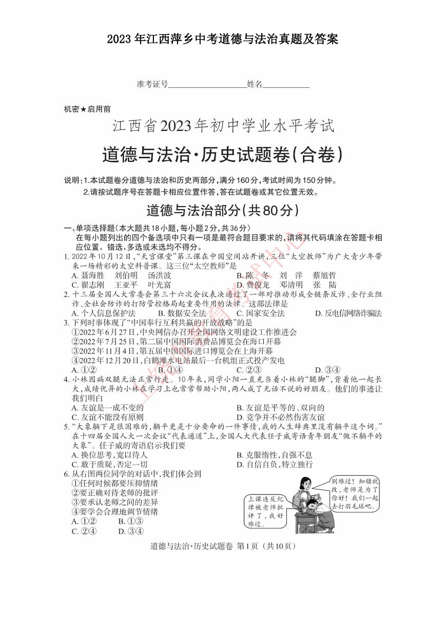 2023年江西萍乡中考道德与法治真题及答案.doc
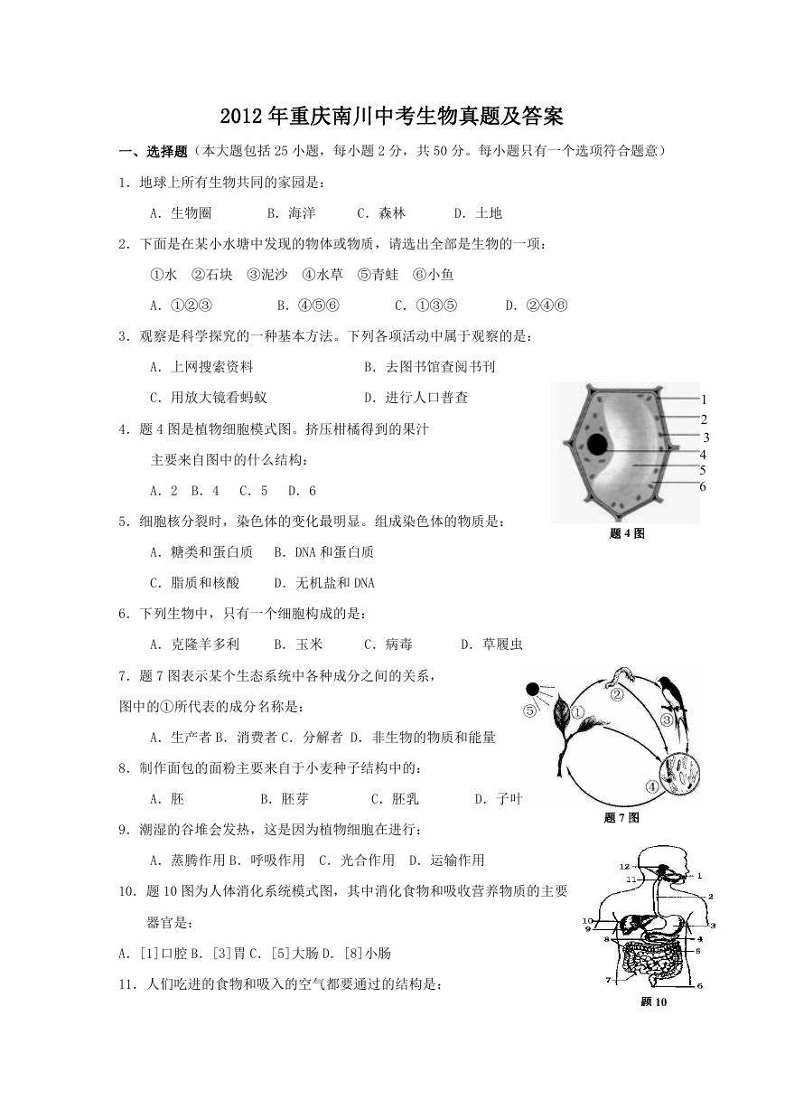 2012年重庆南川中考生物真题及答案.doc
 2013年江西师范大学地理学综合及文艺理论基础考研真题.doc
 2020年四川甘孜小升初语文真题及答案I卷.doc
 2020年注册岩土工程师专业基础考试真题及答案.doc
 2023-2024学年福建省厦门市九年级上学期数学月考试题及答案.doc
 2021-2022学年辽宁省沈阳市大东区九年级上学期语文期末试题及答案.doc
 2022-2023学年北京东城区初三第一学期物理期末试卷及答案.doc
 2018上半年江西教师资格初中地理学科知识与教学能力真题及答案.doc
 2012年河北国家公务员申论考试真题及答案-省级.doc
 2020-2021学年江苏省扬州市江都区邵樊片九年级上学期数学第一次质量检测试题及答案.doc
 2022下半年黑龙江教师资格证中学综合素质真题及答案.doc
 2022-2023学年河北省唐山市高三上学期期末数学试题及答案.doc
 2022-2023学年河北省张家口市高三上学期期末数学试题及答案.doc
 2022-2023学年河北省衡水市高三上学期期末语文试题及答案.doc
 2022-2023学年河北省保定市高三上学期期末数学试题及答案.doc
 2022-2023学年河北省张家口市高三上学期期末语文试题及答案.doc
 2022-2023学年河北省石家庄市高三上学期期末语文试题及答案.doc
 2020-2021年四川省凉山州西昌市高一物理上学期期中试卷及答案.doc
 2020-2021年四川省遂宁市安居区高一英语上学期期中试卷及答案.doc
 2020-2021年四川省西昌市高一英语上学期期中试卷及答案.doc
 2021-2022年四川省广安市岳池县高一地理上学期期中试卷及答案.doc
 2021-2022年四川省成都市郫都区高一物理上学期期中试卷及答案.doc
 2021-2022年四川省广安市岳池县高一物理上学期期中试卷及答案.doc