IELTS WRITING (TASK 1
IELTS WRITING (TASK 1))))
IELTS WRITING (TASK 1
IELTS WRITING (TASK 1
FIGURES = 5S = 5S = 5S = 54 samples)
,CHARTSSSS & & & & FIGURE
,DIAGRAMSSSS,CHART
,TABLESSSS,DIAGRAM
(GRAPHSSSS,TABLE
(GRAPH
4 samples)
FIGURE
,CHART
,DIAGRAM
,TABLE
(GRAPH
(GRAPH
,TABLE
,DIAGRAM
,CHART
FIGURE
4 samples)
4 samples)
IELTS Graph #1
The charts below show the main reasons for study among students of different age groups
and the amount of support they received from employers.
Summarise the information by selecting and reporting the main features, and make
comparisons where relevant.
• You should write at least 150 words.
• You should spend about 20 minutes on this task.
�
model answer:
The first graph shows that there is a gradual decrease in study for career reasons with age. Nearly
80% of students under 26 years, study for their career. This percentage gradually declines by 10-20%
every decade. Only 40% of 40-49yr olds and 18% of over 49yr olds studing for career reasons in late
adulthood.
Conversely, the first graph also shows that study stemming from interest increases with age. There are
only 10% of under 26yr olds studing out of interest. The percentage increases slowly till the beginning
of the fourth decade, and increases dramatically in late adulthood. Nearly same number of 40-49yr
olds study for career and interest. However 70% of over 49yr olds study for interest in comparison to
18% studing for career reasons in that age group.
The second graph shows that employer support is maximum (approximately 60%) for the under 26yr
students. It drops rapidly to 32% up to the third decade of life, and then increses in late adulthood up
to about 44%. It is unclear whether employer support is only for career-focused study, but the highest
level is for those students who mainly study for career purposes.
This is an answer written by a candidate who achieved a Band 8 score. Here is the examiner's
comment:
This answer summarises the key features of both charts and integrates them well. Clear trends are
identified and supported with appropriately-selected figures. The answer could only be improved by
adding an introduction to the general topic of the charts.
The information is well organised, with a clearly-signalled progression. Linking words are used
accurately and precisely, although there is occasional omission. Paragraphing is used well initially, but
lapses in the later section.
A very good range of vocabulary is used to convey the information concisely and accurately with only
occasional inappropriacy. Words are used precisely and there are no errors in spelling or word form.
A wide range of structures is used and most sentences in this answer are accurate. Errors are rare and
do not affect communication in this answer
�
IELTS Graph #2
You should spend about 20 minutes on this task.
The graph and table below give information about water use worldwide and water consumption in two
different countries.
Summarise the information by selecting and reporting the main features, and make comparisons where
relevant.
Write at least 150 words.
model answer:
The graph shows how the amount of water used worldwide changed between 1900 and 2000.
Throughout the century, the largest quantity of water was used for agricultural Purposes, and this increased
dramatically from about 500 km³ to around 3,000 km³ in the year 2000. Water used in the industrial and domestic
sectors also increased, but consumption was minimal until mid-century. From 1950 onwards, industrial use grew
steadily to just over 1,000 km³, while domestic use rose more slowly to only 300 km³, both far below the levels of
consumption by agriculture.
The table illustrates the differences in agriculture consumption in some areas of the world by contrasting the amount
of irrigated land in Brazil (26,500 km³) with that in the D.R.C. (100 km²). This means that a huge amount of water is
used in agriculture in Brazil, and this is reflected in the figures for water consumption per person: 359 m³ compared
with only 8 m³ in the Congo. With a population of 176 million, the figures for Brazil indicate how high agriculture water
consumption can be in some countries.
(180 words)
�
IELTS Graph #3
You should spend about 20 minutes on this task.
The diagram below shows how a central heating system in a house works.
Summarise the information by selecting and reporting the main features, and make comparisons where
relevant.
You should write at least 150 words.
:
SAMPLE ANSWER :
This diagram provides an overview of a domestic central heating system. It shows how the tank, boiler and pipes
ensure a constant flow of hot water to both the radiators and the taps.
The cold water enters the house and is stored in a water storage tank in the roof. From there ü flows down to the
boiler, located on the ground floor of the house.
The boiler, which is fuelled by gas or oil, heats up the water as it passes through it. The hot water is then pumped
round the house through a system of pipes and flows into the radiators, located in different rooms. The water
circulates through the radiators, which have small tubes inside them to help distribute the heat, and this warms each
of the rooms. Some of the water is directed to the taps to provide hot water for the house.
Once the water has been through the pipes and radiators, it is returned to the boiler to be re-heated and circulated
round the house again.
Introduction: First sentence. Overview: Second sentence.
Key features: Entry of cold water into boiler; circulation of hot waterto radiators and taps; return of waterto boiler.
Supporting information: direction of flow; types of boiler; location of radiators; radiator tubes
Paragraph breaks: The paragraph breaks mark stages in the process.
Linkers: and, from there, then, once, again Reference words: it, both, there, which, this
Topic vocabulary: enters, stored, roof, flows, ground floor, located, passes, pumped, system, circulates, heat, directed, returned,
re-heated
Less common vocabulary: ensure, fuelled by, heats up, distribute the heat, warms
Structures: An appropriate mix of active and passive structures and a range of sentence types are used.
Length: 172 words
�
IELTS Graph #4
You should spend about 20 minutes on this task.
The graph below gives information about the preferred leisure activities of Australian children.
Write a report for a university lecturer describing the information shown.
You should write at least 150 words.
model answer:
The graph shows the preferred leisure sctivities of Australian children aged 5-14. As might be expected, it is clear
from the data that sedentary pursuits are far more popular nowadays than active ones.
Of the 10,000 children that were interviewed, all the boys and girls stated that they enjoyed watching TV or videos
in their spare time. In addition, the second most popular activity, attracting 80% of boys and 60% of girls, was
playing electronic or computer games. While girls rated activities such as art and craft highly – just under 60%
stated that they enjoyed these in their spare time – only 35% of boys opted for creative pastimes. Bike riding, on
the other hand, was almost as popular as electronic games amongst boys and, perhaps surprisingly, almost 60%
of girls said that they enjoyed this too. Skateboarding was relatively less popular amongst both boys and girls,
although it still attracted 35% of boys and 25% of girls.
(157 words)
�
IELTS Graph #5
You should spend about 20 minutes on this task.
The table below provide information on rental charges and salaries in three areas of London.
Write a report for a university lecturer describing the information shown below.
You should write at least 150 words.
model answer:
The table shows two sets of related information: the relative cost, in pounds, of renting a property with one, two or
three bedrooms in three different suburbs of London and an indication of the kind of annual salary you would need to
be earning to rent in these areas.
Of the three areas mentioned, Notting Hill is the most expensive with weekly rents starting at £375 (salary
approximately f 100,000) and rising to £738 per week for a 3-bedroom property. To afford this, you would require a
salary in the region of £200,000 per annum. Alternatively, Fulham is the cheapest area shown with rents ranging from
£215 per week for a one bedroom property to £600 per week for a 3-bedroom property. To rent in this area, salaries
need to be somewhere between £85,000 and £170,000 depending on the number of bedrooms required. For those
able to pay in the middle price range for accommodation, Regent's Park might be a more suitable district.
(163 words)
�
IELTS Graph #6
You should spend about 20 minutes on this task.
The diagrams below give information about the Eiffel Tower in Paris and an outline project to extend it
underground.
Write a report for a university lecturer describing the information shown.
You should write at least 150 words.
model answer:
The Eiffel Tower is situated close to the Seine River in Paris. It is a metal structure that is 1,063 feet high and weighs 7,417 tonnes.
The tower has been a tourist attraction since 1889, when it was built, and there are 1,665 steps that can be climbed in order to
reach the two viewing platforms.
There are now plans to build below the foundations of the tower. These plans include the development of five underground levels
that will incorporate the tower's ticket office, shopping facilities, a cinema and museum and two floors of underground parking.
Although details have yet to be finalised, the principle is that the five floors will be connected by two vertical passenger lifts on
either side of the tower. In addition, the floor immediately below the tower, which is planned to house the ticket office, will also
consist of a large atrium with a glass ceiling so that visitors can look directly up at the tower itself.
(162 words)
�
IELTS Graph #7
You should spend about 20 minutes on this task.
The diagram below gives the information about the Hawaiian island chain in the centre of the Pacific Ocean.
Write a report for a university lecturer describing the information shown.
You should write at least 150 words.
model answer:
The Hawaiian island chain, in the centre of the Pacific Ocean, is approximately 2,700 km in length. It is formed of
volcanoes and the active ones are at the south-east tip of the archipelago, where Hawaii itself is located.
It is believed that the chain began to form nearly 80 million years ago. Each island started to evolve after an eruption
on the sea floor. First, a `hot spot' existed on the ocean bed, which let out a plume of material called magma. This
magma may originate as deep as 2,883km below the ocean bed. Next, further eruptions took place, which built up
the volcano. Eventually, it emerged above the surface of the ocean.
Since that time, the spume of magma has remained static as the Pacific tectonic plate moves in a north-west
direction across it at a speed of 7-9cm per year. As it moves, a volcano forms as it passes over the hotspot and then
become inactive when it has passed it.
(164 words)
�


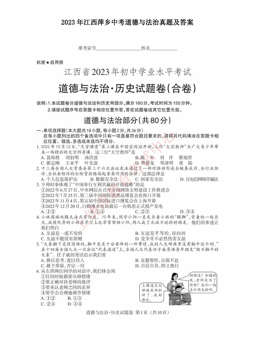 2023年江西萍乡中考道德与法治真题及答案.doc
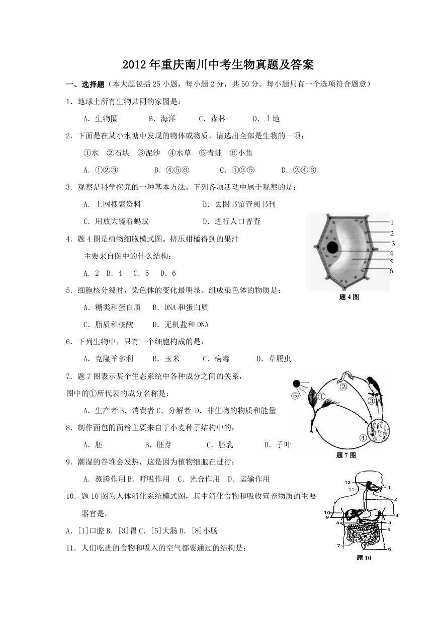 2012年重庆南川中考生物真题及答案.doc
 2013年江西师范大学地理学综合及文艺理论基础考研真题.doc
 2020年四川甘孜小升初语文真题及答案I卷.doc
 2020年注册岩土工程师专业基础考试真题及答案.doc
 2023-2024学年福建省厦门市九年级上学期数学月考试题及答案.doc
 2021-2022学年辽宁省沈阳市大东区九年级上学期语文期末试题及答案.doc
 2022-2023学年北京东城区初三第一学期物理期末试卷及答案.doc
 2018上半年江西教师资格初中地理学科知识与教学能力真题及答案.doc
 2012年河北国家公务员申论考试真题及答案-省级.doc
 2020-2021学年江苏省扬州市江都区邵樊片九年级上学期数学第一次质量检测试题及答案.doc
 2022下半年黑龙江教师资格证中学综合素质真题及答案.doc
 2022-2023学年河北省唐山市高三上学期期末数学试题及答案.doc
 2022-2023学年河北省张家口市高三上学期期末数学试题及答案.doc
 2022-2023学年河北省衡水市高三上学期期末语文试题及答案.doc
 2022-2023学年河北省保定市高三上学期期末数学试题及答案.doc
 2022-2023学年河北省张家口市高三上学期期末语文试题及答案.doc
 2022-2023学年河北省石家庄市高三上学期期末语文试题及答案.doc
 2020-2021年四川省凉山州西昌市高一物理上学期期中试卷及答案.doc
 2020-2021年四川省遂宁市安居区高一英语上学期期中试卷及答案.doc
 2020-2021年四川省西昌市高一英语上学期期中试卷及答案.doc
 2021-2022年四川省广安市岳池县高一地理上学期期中试卷及答案.doc
 2021-2022年四川省成都市郫都区高一物理上学期期中试卷及答案.doc
 2021-2022年四川省广安市岳池县高一物理上学期期中试卷及答案.doc