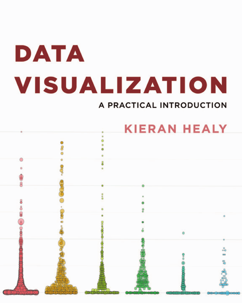
Cover
Title
Dedication
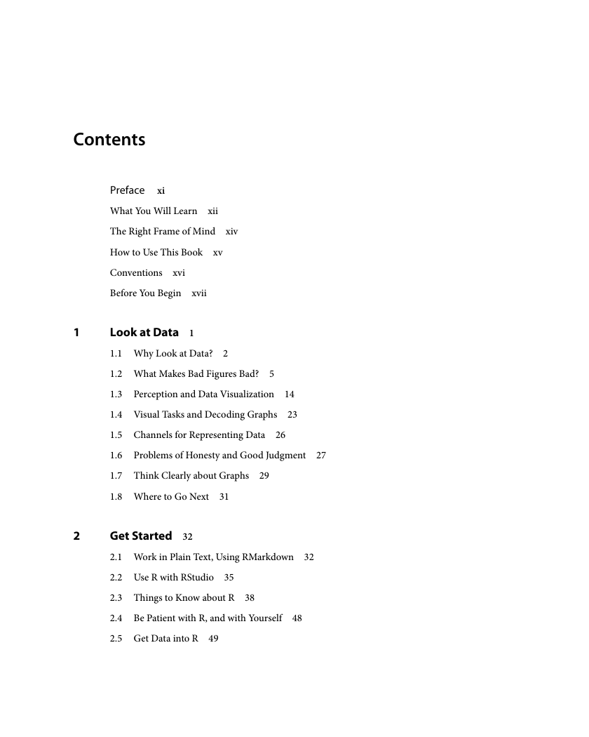
Contents
Preface
What You Will Learn
The Right Frame of Mind
How to Use This Book
Conventions
Before You Begin
1 Look at Data
1.1 Why Look at Data?
1.2 What Makes Bad Figures Bad?
1.3 Perception and Data Visualization
1.4 Visual Tasks and Decoding Graphs
1.5 Channels for Representing Data
1.6 Problems of Honesty and Good Judgment
1.7 Think Clearly about Graphs
1.8 Where to Go Next
2 Get Started
2.1 Work in Plain Text, Using RMarkdown
2.2 Use R with RStudio
2.3 Things to Know about R
2.4 Be Patient with R, and with Yourself
2.5 Get Data into R
2.6 Make Your First Figure
2.7 Where to Go Next
3 Make a Plot
3.1 How Ggplot Works
3.2 Tidy Data
3.3 Mappings Link Data to Things You See
3.4 Build Your Plots Layer by Layer
3.5 Mapping Aesthetics vs Setting Them
3.6 Aesthetics Can Be Mapped per Geom
3.7 Save Your Work
3.8 Where to Go Next
4 Show the Right Numbers
4.1 Colorless Green Data Sleeps Furiously
4.2 Grouped Data and the “Group” Aesthetic
4.3 Facet to Make Small Multiples
4.4 Geoms Can Transform Data
4.5 Frequency Plots the Slightly Awkward Way
4.6 Histograms and Density Plots
4.7 Avoid Transformations When Necessary
4.8 Where to Go Next
5 Graph Tables, Add Labels, Make Notes
5.1 Use Pipes to Summarize Data
5.2 Continuous Variables by Group or Category
5.3 Plot Text Directly
5.4 Label Outliers
5.5 Write and Draw in the Plot Area
5.6 Understanding Scales, Guides, and Themes
5.7 Where to Go Next
6 Work with Models
6.1 Show Several Fits at Once, with a Legend
6.2 Look Inside Model Objects
6.3 Get Model-Based Graphics Right
6.4 Generate Predictions to Graph
6.5 Tidy Model Objects with Broom
6.6 Grouped Analysis and List Columns
6.7 Plot Marginal Effects
6.8 Plots from Complex Surveys
6.9 Where to Go Next
7 Draw Maps
7.1 Map U.S. State-Level Data
7.2 America’s Ur-choropleths
7.3 Statebins
7.4 Small-Multiple Maps
7.5 Is Your Data Really Spatial?
7.6 Where to Go Next
8 Refine Your Plots
8.1 Use Color to Your Advantage
8.2 Layer Color and Text Together
8.3 Change the Appearance of Plots with Themes
8.4 Use Theme Elements in a Substantive Way
8.5 Case Studies
8.6 Where to Go Next
Acknowledgments
Appendix
1 A Little More about R
2 Common Problems Reading in Data
3 Managing Projects and Files
4 Some Features of This Book
References
Index





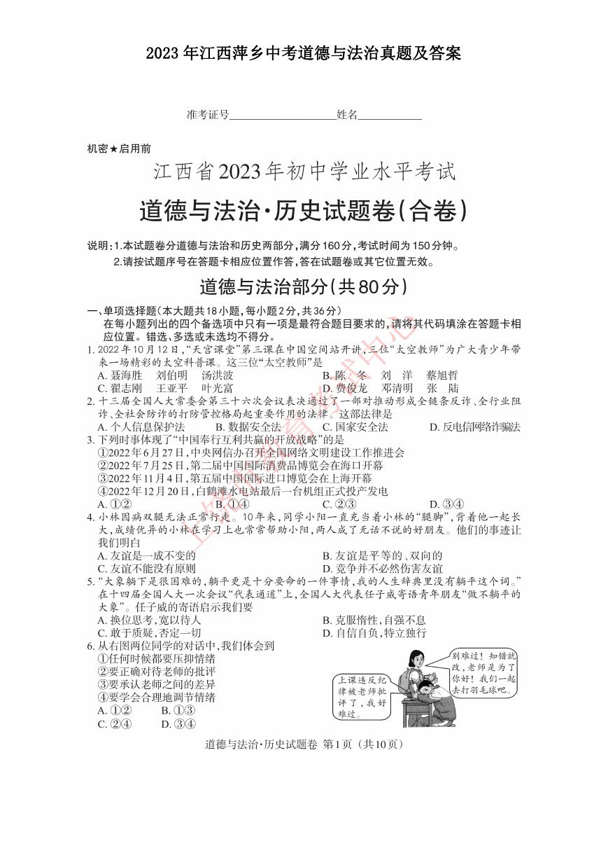 2023年江西萍乡中考道德与法治真题及答案.doc
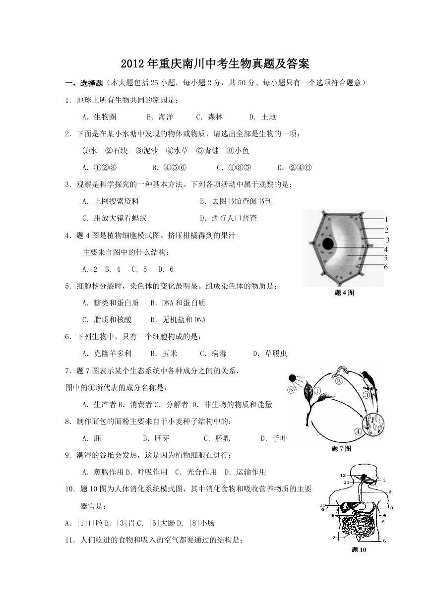 2012年重庆南川中考生物真题及答案.doc
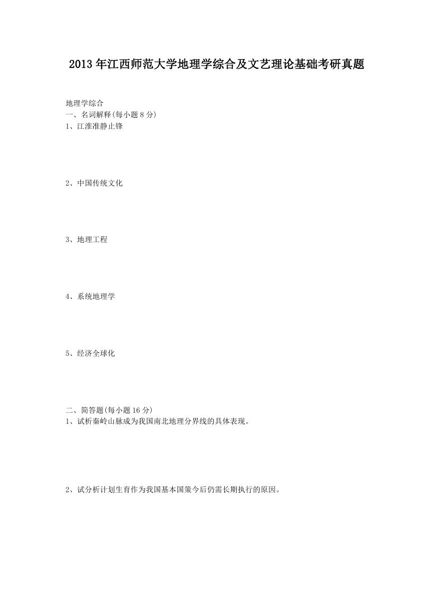 2013年江西师范大学地理学综合及文艺理论基础考研真题.doc
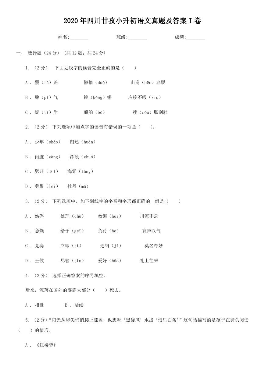 2020年四川甘孜小升初语文真题及答案I卷.doc
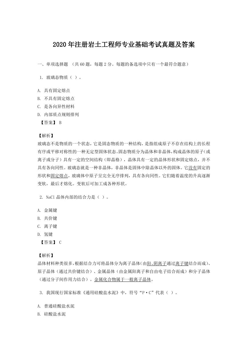 2020年注册岩土工程师专业基础考试真题及答案.doc
 2023-2024学年福建省厦门市九年级上学期数学月考试题及答案.doc
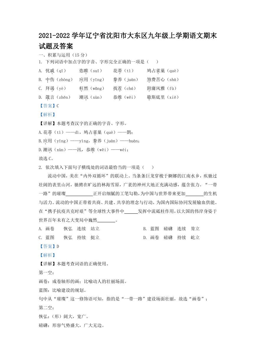 2021-2022学年辽宁省沈阳市大东区九年级上学期语文期末试题及答案.doc
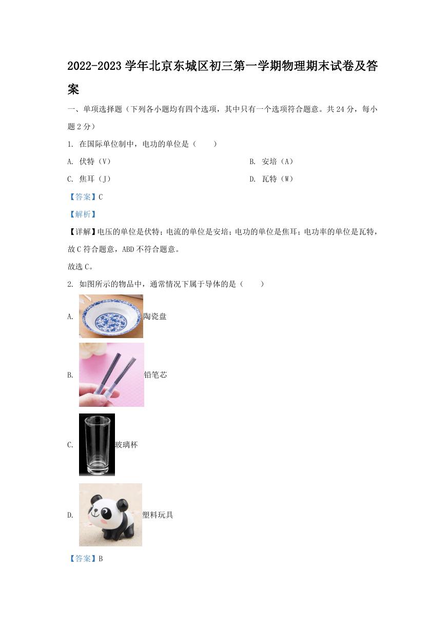 2022-2023学年北京东城区初三第一学期物理期末试卷及答案.doc
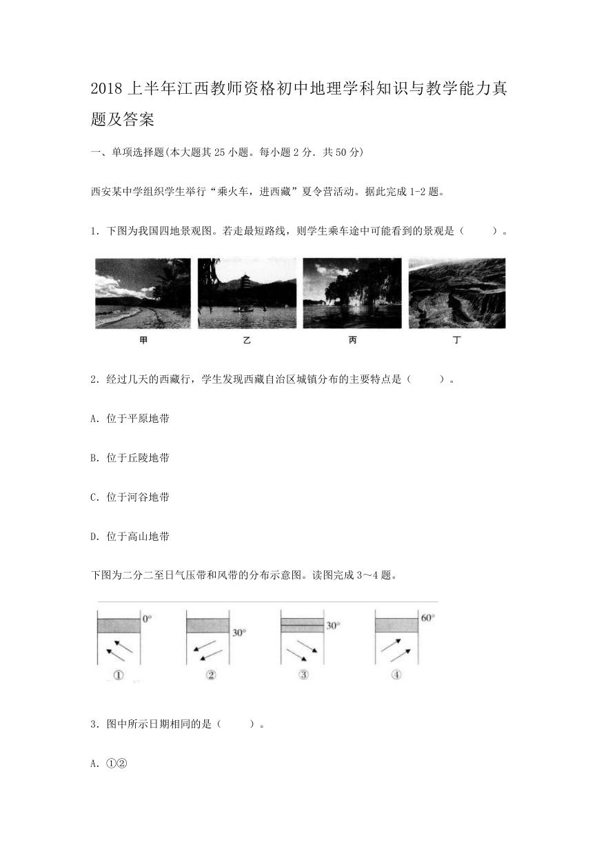 2018上半年江西教师资格初中地理学科知识与教学能力真题及答案.doc
 2012年河北国家公务员申论考试真题及答案-省级.doc
 2020-2021学年江苏省扬州市江都区邵樊片九年级上学期数学第一次质量检测试题及答案.doc
 2022下半年黑龙江教师资格证中学综合素质真题及答案.doc