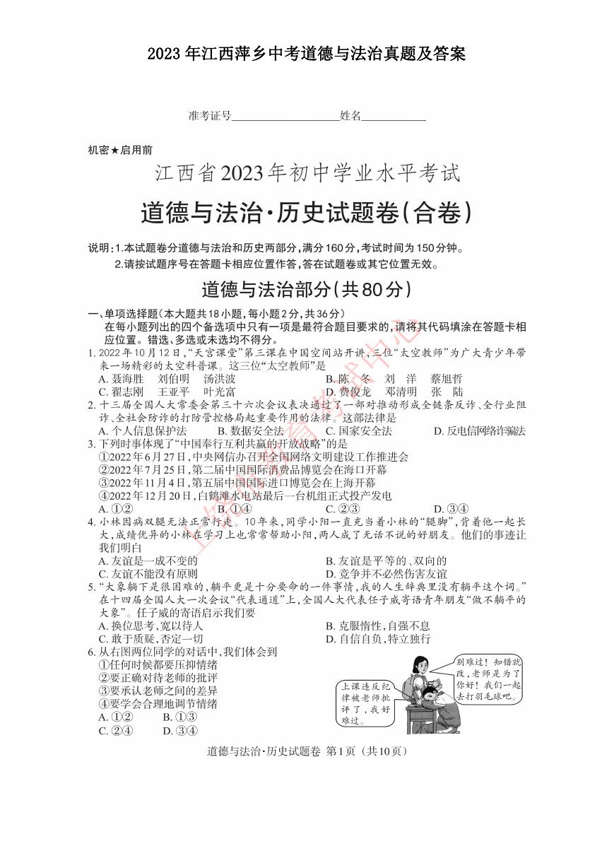
微信小程序使用echarts获取数据并生成折线图
微信小程序使用
获取数据并生成折线图
主要介绍了微信小程序使用echarts获取数据并生成折线图,文中通过示例代码介绍的非常详细,对大家的学习或
者工作具有一定的参考学习价值,需要的朋友可以参考下
微信小程序使用echarts,实现左右双Y轴,动态获取数据,生成折线图
本来使用的是wxcharts,但发现实现不了左右双y轴的效果,就换成echarts
要实现这样的效果,需要以下几步:
(1)去github下载插件,放进自己的项目里
只需要将名称是ec-canvas的文件夹放进自己项目里。
像这样:
(2)分别写小程序的四个文件
①
echart.json
{
"usingComponents": {
"ec-canvas": "../../ec-canvas/ec-canvas"
}
}
②
③
echart.wxss
.container{
margin: 0;
padding: 0
}
④
echart.js
这里分步写:
第一步:导入 echarts 插件
import * as echarts from '../../ec-canvas/echarts';
第二步:写在Page外的方法
function echart(chart, leftData, rightData) {//leftData是坐标系左边y轴,rightData是右边y轴
var option = {
//网格
grid: {
bottom: 80,
show: true,
// containLabel: true
},
//图例
legend: {
data: [{
name: 'leftData',
textStyle: { //设置颜色
color: '#6076FF',
fontSize: '14',
}
},
{
name: 'rightData',
textStyle: {
�
color: '#FFC560',
fontSize: '14',
}
}
],
x: 'left',
bottom: 15,
left: 30
},
//x轴
xAxis: {
type: 'category',
boundaryGap: false,
disableGrid: true, //绘制X网格
data: ['', '', '', '', '', '', '', '', ''],
splitLine: {
show: true,
// 改变轴线颜色
lineStyle: {
// 使用深浅的间隔色
color: ['#DDDDDD']
}
},
//去掉刻度
axisTick: {
show: false
},
//去掉x轴线
axisLine: {
show: false
},
},
//y轴
yAxis: [{
name: 'mph',
type: 'value',
min: 0,
// max: 40,
//y标轴名称的文字样式
nameTextStyle: {
color: '#FFC560'
},
//网格线
splitLine: {
show: true,
lineStyle: {
color: ['#DDDDDD']
}
},
//去掉刻度
axisTick: {
show: false
},
//去掉y轴线
axisLine: {
show: false
},
},
{
name: 'g',
type: 'value',
// max: 4,
min: 0,
nameTextStyle: {
color: '#6076FF'
},
//去掉刻度
axisTick: {
show: false
},
//去掉y轴线
axisLine: {
show: false
},
}
],
series: [{
name: 'leftData',
type: 'line',
�
animation: true, //动画效果
symbol: 'none',
//折线区域
areaStyle: {
//渐变颜色
color: {
type: 'linear',
x: 0,
y: 0,
x2: 0,
y2: 1,
colorStops: [{
offset: 0,
color: '#6076FF' // 0% 处的颜色
}, {
offset: 1,
color: 'rgba(96,118,255,0.1)' // 100% 处的颜色
}],
global: false, // 缺省为 false
},
},
//折线宽度
lineStyle: {
width: 2
},
color: '#6076FF',
data: leftData // 后台传过来的动态数据
//设置固定的数据
// data: [
// 23, 30, 20, 23, 30, 26, 20, 25, 25
// ]
},
{
name: 'rightData',
type: 'line',
yAxisIndex: 1,
animation: true,
symbol: 'none',
areaStyle: {
color: {
type: 'linear',
x: 0,
y: 0,
x2: 0,
y2: 1,
colorStops: [{
offset: 0,
color: '#FFC560' // 0% 处的颜色
}, {
offset: 1,
color: 'rgba(255, 197, 96,0.3)' // 100% 处的颜色
}],
global: false, // 缺省为 false
},
},
lineStyle: {
width: 2
},
color: '#FFC560',
data: rightData,//后台传过来的动态数据
//设置固定的数据
// data: [
// 2, 1, 0.5, 0.9, 2, 1.0, 0.6, 2, 0.5
// ]
}]
}
}
第三步:写在Page里的方法,(包括onLoad(),初始化)
/**
* 页面的初始数据
*/
data: {
ec: {
lazyLoad: true //初始化加载
}
},
onLoad: function (options) {
let that = this;
this.oneComponent = this.selectComponent('#mychart');
�
let url = "xxxxx";
let params = {
"openId": options.id,
};
wx.request({
url: "xxxx",
method: 'POST'
data: params,
header: header,
success: (res) => {
that.setData({
leftData: xxx,//从后台获取的数据
rightData: xxxx //从后台获取的数据
});
},
//给图表加上数据
that.initGraph(that.data.leftData, that.data.rightData)
})
}
初始化图表
initGraph: function (leftData, rightData) {
this.oneComponent.init((canvas, width, height) => {
const chart = echarts.init(canvas, null, {
width: width,
height: height
});
initChart(chart, leftData, rightData);
this.chart = chart;
return chart;
});
}
以上就是本文的全部内容,希望对大家的学习有所帮助,也希望大家多多支持我们。
�


 2023年江西萍乡中考道德与法治真题及答案.doc
 2012年重庆南川中考生物真题及答案.doc
 2013年江西师范大学地理学综合及文艺理论基础考研真题.doc
 2020年四川甘孜小升初语文真题及答案I卷.doc
 2020年注册岩土工程师专业基础考试真题及答案.doc
 2023-2024学年福建省厦门市九年级上学期数学月考试题及答案.doc
 2021-2022学年辽宁省沈阳市大东区九年级上学期语文期末试题及答案.doc
 2022-2023学年北京东城区初三第一学期物理期末试卷及答案.doc
 2018上半年江西教师资格初中地理学科知识与教学能力真题及答案.doc
 2012年河北国家公务员申论考试真题及答案-省级.doc
 2020-2021学年江苏省扬州市江都区邵樊片九年级上学期数学第一次质量检测试题及答案.doc
 2022下半年黑龙江教师资格证中学综合素质真题及答案.doc
 2022-2023学年河北省唐山市高三上学期期末数学试题及答案.doc
 2022-2023学年河北省张家口市高三上学期期末数学试题及答案.doc
 2022-2023学年河北省衡水市高三上学期期末语文试题及答案.doc
 2022-2023学年河北省保定市高三上学期期末数学试题及答案.doc
 2022-2023学年河北省张家口市高三上学期期末语文试题及答案.doc
 2022-2023学年河北省石家庄市高三上学期期末语文试题及答案.doc
 2020-2021年四川省凉山州西昌市高一物理上学期期中试卷及答案.doc
 2020-2021年四川省遂宁市安居区高一英语上学期期中试卷及答案.doc
 2020-2021年四川省西昌市高一英语上学期期中试卷及答案.doc
 2021-2022年四川省广安市岳池县高一地理上学期期中试卷及答案.doc
 2021-2022年四川省成都市郫都区高一物理上学期期中试卷及答案.doc
 2021-2022年四川省广安市岳池县高一物理上学期期中试卷及答案.doc