�
~
Me
NQN-
DeSIGNeK'S
DeSIGN
DOQK
StCQND tDITIQN
design
and
typographic
principles
for the
visual
novice
Robin Williams
Peach pit Press
A Berkeley
y
California
g The Non-Designer's Design Book
second edition
ROBIN WILLIAMS
@ZOO4 by Robin Williams
Peach
pit Press
1249 Eighth
Street
Berkeley,
California
94710
800.283.9444
510.524.2178
510.524.2221
FAX
Editor:
Cover design
and production:
Nancy Davis
John Tollett
Interior
design:
Robin Williams
Production:
Laura Taylor and Robin Williams
Peachpit Press'is
a division of Pearson Education.
Find us on the web at www.peachpit.com.
The quote
by Jan White
by Alex White. Reprinted
Roundtable
Press,
Inc.
on page 165 is from the out-of-print
book How to Spec Type,
courtesy
of Roundtable
Press,
Inc. Copyright
1987 by
The charming
Jon Vlakos,
pen-and-ink
drawing
of the wicket woof on pages
reprinted
courtesy
of Swamp
Press. Copyright
44 and 45 are by
Press.
1990 by Swamp
You can order
an exquisite
little handmade
letterpressed
booklet
of the tale of
"Ladle Rat Rotten Hut,H by Howard
order
to Swamp
Press,
323 Pelham Road, Amherst, MA, 01002.
L. Chace. Send $4 per booklet,
plus $2.50 per
The portions
of other
stories,
such as "Guilty Looks Enter Tree Beers:'
"Center
Alley," and "Violate Huskings"
Chace
called Anguish
Languish.
are from a long out-of-print
It is our understanding
that
book by Howard
these
delightful
L.
stories
are now in the public
domain.
They are easily found
on the Internet.
Notice of rights
All rights
any form or by any means,
reserved.
No part of this book may be reproduced
or transmitted
in
electronic,
mechanical,
photocopying,
recording,
or
otherwise,
without
the prior written
permission
of the publisher.
information
For
permissions@peachpit.com.
on obtaining
permission
for reprints
and excerpts,
please
contact
Notice of liability
The information
in this book is distributed
While
every
precaution
has been
taken
on an "as is" basis, without warranty.
neither
of this book,
in the preparation
the author
respect
nor Peachpit
to any liability,
loss, or damage
indirectly
by the instructions
contained
or alleged
caused
to be caused
in this book or by the computer
or entity with
or
directly
software
Press
shall have any liability
to any person
and hardware
products
described
herein.
ISBN:
0-321-19385.7
10987654321
Printed
and bound
in the United
States
of America
�
'IO Carmen Sheldon,
in 1)esign,
my comrade
my friend
in 'Life.
with
great
love,
-
.
.
.
'R.
�
II
0< ~- ,,"o.d
aybi:ver before, and evel)' publisher
t
of an advertisement,
expects his material
and, even more so, readers want what
pamphlet.
to be read. Publishers
is
'"'"~""'~
or book
important
to be clearly laid out. They will
not read anything
that
is troublesome
to read,
but are pleased with what
well arranged,
for it will make their
task
looks clear and
of understanding
easier
. For
this
reason,
the important
unimportant must be subdued.
part must stand out and the
. . .
The technique
of modern typography must
also adapt
Today, we cannot
itself to the speed of our times.
spend as much time on
a letter heading
or other piece of jobbing
as was possible
even in the nineties.
-Jan
TdChicholo, 1935
�
Contents
Is this book for you?
Mini-glossary.
.
. . . .
B~~ig12 Fri126i1?li~
~i The Joshua tree.e~i.Ph~ny
The four basic principles.
Proximity
Alignment
Repetition
Contrast
~ ~::C:~~::Ximity.......
The basic purpose
How to get it
What
to avoid
..
..
..
r:::::'
Summaryofalignment.. . . . . .
The basic purpose
How to get it
What
to avoid
i 3 Alignment
. ~~~~i~ir~p~tition.....
The basic purpose
How to get it
What
to avoid
5 ~u~~~~~~~ontrast.......
The basic purpose
How to get it
What
to avoid
..
..
..
..
D:
. ..
9
10
.1,~
15
30
31
48
49
62
63
78
�
II
CONTENTS
Review
Proximity.
Alignment.
Repetition.
Contrast.
. . . . . . . . . . . . . . . . . . . . . . . . . . . . . . . ..
. . . . . . . . . . . . . . . . . . . . . . . . . . . . . . ..
. . . . . . . . . . . . . . . . . . . . . . . . . . . . . . ..
. . . . . . . . . . . . . . . . . . . . . .
. ..
. . .
. . . .
Little Quiz #1:Designprinciples.
Little Quiz #2: Redesign this ad.
. ..
Summary
79
80
81
82
83
84
85
86
.
. . .
...
..
a package
. . . . . . .
and envelopes.
87
Extra tips & tricks
88
Creating
89
Business cards.
93
Letterhead
97
Flyers
Newsletters.
. . . . . . . . . . . . . . . . . . . . . . . . . . . . . . . 101
Brochures.. . . . . . . . . . . . . . . . . . . . . . . . . . . . . . . . . 105
. . . . . . . . . . . . . . . . . . . . . . . . . . . . . . . . . 109
Postcards.
113
Newspaper
ads
Websites. . . . . . . . . . . . . . . . . . . . . . .
. .. 117
. . . . . . . . . . ..
�
CONTENTS
D
'4\eSi m>''-i
.LJ.: 15.,L,\ll...5
t2m> '\ hri t~ ~H~E
j(,v 1 l'L ..LtH+"'"
.
Type (& Life)
Concord.
Conflict.
Contrast
Summary.
.
Categories Of type
Oldstyle.
Modern.
Slab serif.
Sans serif.
Script.
.
Decorative.
Be conscious.
. . . . . . . . .
. . . . . .
Little Quiz #3: Categoriesof type.
. . .
Little Quiz #4: Thick/thin transitions.
Little Quiz #5:Serifs.
. . . .
Summary.
.
Type contrasts
Size.
Weight..
Structure.
Form.
Direction.
Color.
Combine the contrasts.
Summary..
..
..
. . . . . .
..
..
..
..
..
Little Quiz #6: Contrast or conflict.
Little Quiz #7: Dos and don'ts.
An exercise in combining contrasts.
..
. .
. . .
123
124
126
128
130
. . ..
131
. . 132
133
134
135
137
138
139
139
140
141
142
143
144
148
152
156
. 160
164
170
171
. . 172
173
174
�


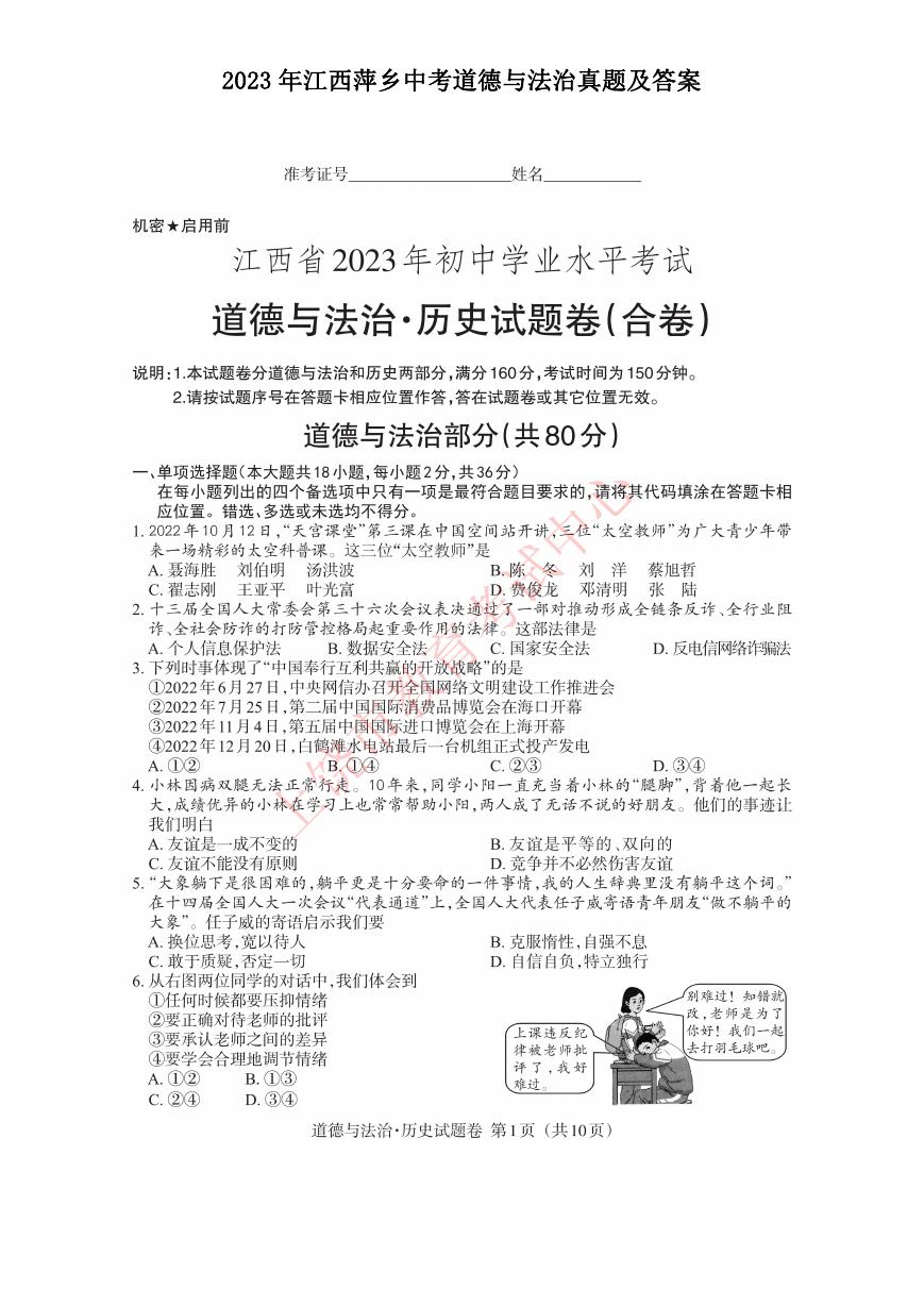 2023年江西萍乡中考道德与法治真题及答案.doc
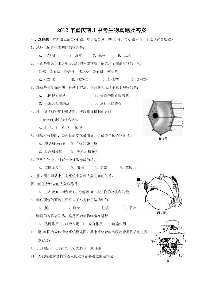 2012年重庆南川中考生物真题及答案.doc
 2013年江西师范大学地理学综合及文艺理论基础考研真题.doc
 2020年四川甘孜小升初语文真题及答案I卷.doc
 2020年注册岩土工程师专业基础考试真题及答案.doc
 2023-2024学年福建省厦门市九年级上学期数学月考试题及答案.doc
 2021-2022学年辽宁省沈阳市大东区九年级上学期语文期末试题及答案.doc
 2022-2023学年北京东城区初三第一学期物理期末试卷及答案.doc
 2018上半年江西教师资格初中地理学科知识与教学能力真题及答案.doc
 2012年河北国家公务员申论考试真题及答案-省级.doc
 2020-2021学年江苏省扬州市江都区邵樊片九年级上学期数学第一次质量检测试题及答案.doc
 2022下半年黑龙江教师资格证中学综合素质真题及答案.doc
 2022-2023学年河北省唐山市高三上学期期末数学试题及答案.doc
 2022-2023学年河北省张家口市高三上学期期末数学试题及答案.doc
 2022-2023学年河北省衡水市高三上学期期末语文试题及答案.doc
 2022-2023学年河北省保定市高三上学期期末数学试题及答案.doc
 2022-2023学年河北省张家口市高三上学期期末语文试题及答案.doc
 2022-2023学年河北省石家庄市高三上学期期末语文试题及答案.doc
 2020-2021年四川省凉山州西昌市高一物理上学期期中试卷及答案.doc
 2020-2021年四川省遂宁市安居区高一英语上学期期中试卷及答案.doc
 2020-2021年四川省西昌市高一英语上学期期中试卷及答案.doc
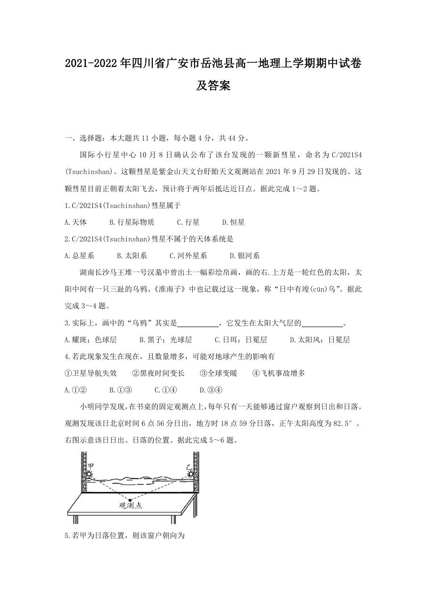 2021-2022年四川省广安市岳池县高一地理上学期期中试卷及答案.doc
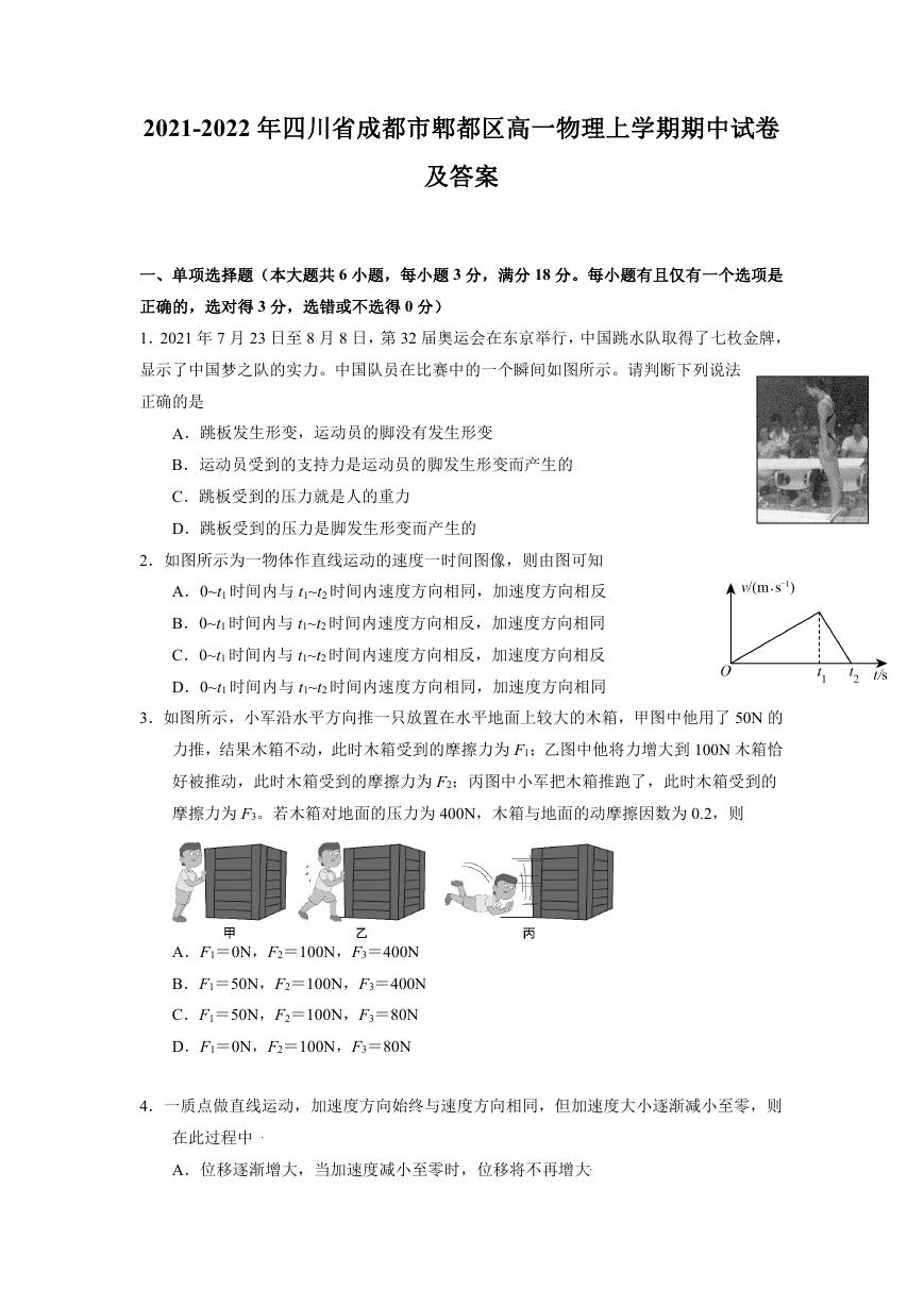 2021-2022年四川省成都市郫都区高一物理上学期期中试卷及答案.doc
 2021-2022年四川省广安市岳池县高一物理上学期期中试卷及答案.doc