QML 是什么?
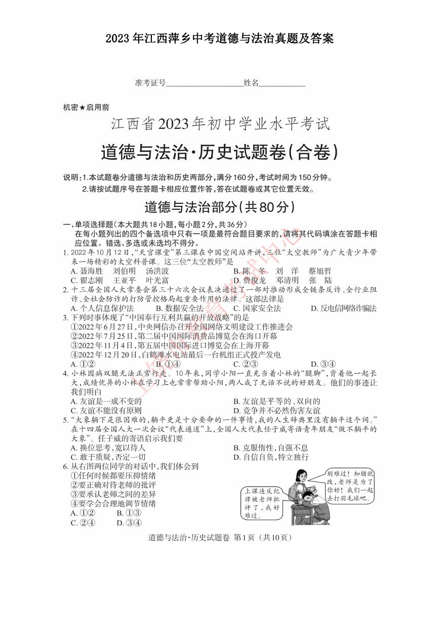
QML 入门教程(1)
QML 是一种描述性的脚本语言,文件格式以.qml 结尾。语法格式非常像 CSS(参
考后文具体例子),但又支持 javacript 形式的编程控制。它结合了 QtDesigner
UI 和 QtScript 的优点。QtDesigner 可以设计出.ui 界面文件,但是不支持和 Qt
原生 C++代码的交互。QtScript 可以和 Qt 原生代码进行交互,但是有一个缺点,
如果要在脚本中创建一个继承于 QObject 的图形对象非常不方便,只能在 Qt 代
码中创建图形对象,然后从 QtScript 中进行访问。而 QML 可以在脚本里创建
图形对象,并且支持各种图形特效,以及状态机等,同时又能跟 Qt 写的 C++代
码进行方便的交互,使用起来非常方便。
如何使用?
在 Qt C++文件中通过 QDeclarativeView 加载,就像使用 UiLoader 加载.ui
文件一样。不过本文不会去介绍如何在 Qt C++中使用 QML,而是把重点放在
QML 的语法上,不过别担心看不到.qml 文件的效果。Qt 提供了一个工具 QML
Viewer 可以查看.qml 文件生成的效果,该程序在 Qt 的 bin 目录下,应用名字叫
qml(Windows 下叫 qml.exe)。所以你在看到别人提供的.qml 文件时,你可以用
下面命令 qml filename.qml 查看.qml 的执行结果,咱们的第一个 Hello,World
生成界面如下
开始 QML 吧
上面的 Hello,World 源代码如下
�
Js 代码
1. import QtQuick 1.0
2.
3. Rectangle {
id: page
4.
width: 500; height: 200
5.
6.
color: "lightgray"
7.
8.
9.
10.
11.
12.
13.
14.
15. }
Text {
id: helloText
text: "Hello world!"
y: 30
anchors.horizontalCenter: page.horizontalCenter
font.pointSize: 24; font.bold: true
}
第 1 行是 Qt QML 的统一用法,指明当前 QML 会使用 Qt-4.7 里已经定义好的类型,
比如第 3 行的 Rectangle 和第 8 行的 Text。
第 3 行开始至文章结束处则定义了一个矩形的图形区域对象,第 4 行则申明了该
矩形区域对象的 id 为”page”可以被其它对象识别并通过该 id 访问其成员属
性,另外几个属性 width/height/color 则很好理解,语法跟 CSS 类似,可以写
在一行中用分号”;”隔开。
第 8 行至第 12 行则是一个文本对象,看它代码的嵌套结构可以知道它是内嵌于
Rectangle 的。Text 的属性除了 anchors 其它几个都能顾名思义。anchors 描诉
的是当前对象的位置和其它对象的相对关系,这里看到其水平中心位置在
“page“的水平中心位置。如果想对 anchors 了解更多,请参考锚的解释。
以上就是 Hello,World 的全部代码,将其存为 hellowordl.qml,那么只要执行
qml hellowrold.qml 就能看到文章前头的界面了。
更多对象?
在上面的代码中我们用到了 Rectangle 和 Text,那么我还有哪些对象以及这些
对象有哪些属性呢。那么请访问 QML-Item 类,Item 类是 QML 最基础的类,通过
查看它的继承类以及这些继承类可用的属性,你可以添加更多你感兴趣的内容。
�
QML 入门教程(2)
在上一篇文章里我们使用了最基础的 QML 类型实现了文字 Hello,World 的显示。
这篇文章中将会增加颜色选项面板,用户可以给 Hello,World 设置不同的颜
色,如下图显示
QML 组件
从图中可以看到选项面板由 6 个颜色小块组成,它们唯一的区别就是颜色不一
样。那么我们就可以用组件(Component)来实现一个颜色块,然后在需要的时候
使用这个组件就可以了。组件其实和其它编程语言中的宏,函数,类,结构体等
功能差不多,就是代码复用。作为程序员,我知道你懂的。组件由一个单独的
QML 文件名组成,文件名总是以大写字母开头,要使用该组件的时候直接使用该
文件名就可以了。关于如何定义自己的组件,请访问 Defining new Components。
我们为一个颜色块定义了一个 Cell.qml 文件,然后使用 Cell 作为一个去访问它。
Cell.qml 的内容
Js 代码
1. import QtQuick 1.0
2.
3. Item {
4.
5.
6.
7.
8.
9.
width: 40; height: 25
id: container
property alias cellColor: rectangle.color
signal clicked(color cellColor)
�
Rectangle {
id: rectangle
border.color: "white"
anchors.fill: parent
}
MouseArea {
anchors.fill: parent
onClicked: container.clicked(container.cellColor)
}
10.
11.
12.
13.
14.
15.
16.
17.
18.
19.
20. }
挨个看代码~
Js 代码
1. Item {
2.
3.
4.
5.
6.
id: container
property alias cellColor: rectangle.color
signal clicked(color cellColor)
width: 40; height: 25
Item 是最常使用的 QML 类型,一般用作其它类型的容器,可以理解成最顶级的
父类,功能类似于 QtGui 中的 QWidget。用一个属性别名访问其内嵌对象
rectangle 的 color 属性。在其它文件中可以用 Cell 对象的 cellColor 获得
rectangle 的 color 值。 signal clicked(color cellColor)则为对象定义了
一个信号,在代码的其它部分可以发出这个信号。
Js 代码
1. Rectangle {
2.
3.
4.
5.
}
id: rectangle
border.color: "white"
anchors.fill: parent
这一部分没有特别好说的,在 Item 中内嵌了一个 id 为 rectangle 白边框的矩形
区域,大小占满整个 Item。
�
Js 代码
1. MouseArea {
2.
3.
4.
}
anchors.fill: parent
onClicked: container.clicked(container.cellColor)
MouseArea 则为 Item 增加了一块鼠标响应区,看它的 anchors 知道,在整个 Item
区域内都是鼠标活动区,都能侦听到鼠标事件。 onClicked 那一行则相当于为
鼠标单击事件增加了一个处理行为,这里是发出了一个 clicked()的信号。这个
信号正是我们在 Item 里定义的那 个 signal。 Cell.qml 写完了,再来看看程
序的主文件。
main.qml 的内容
Js 代码
Rectangle {
id: page
width: 500; height: 200
color: "lightgray"
id: helloText
text: "Hello world!"
y: 30
anchors.horizontalCenter: page.horizontalCenter
font.pointSize: 24; font.bold: true
Text {
1. import QtQuick 1.0
2.
3.
4.
5.
6.
7.
8.
9.
10.
11.
12.
13.
14.
15.
16.
17.
18.
19.
20.
21.
22.
Grid {
}
r }
id: colorPicker
x: 4; anchors.bottom: page.bottom; anchors.bottomMargin: 4
rows: 2; columns: 3; spacing: 3
Cell { cellColor: "red"; onClicked: helloText.color = cellColor }
Cell { cellColor: "green"; onClicked: helloText.color = cellColo
�
Cell { cellColor: "blue"; onClicked: helloText.color = cellColo
Cell { cellColor: "yellow"; onClicked: helloText.color = cellColo
Cell { cellColor: "steelblue"; onClicked: helloText.color = cellCol
Cell { cellColor: "black"; onClicked: helloText.color = cellColo
23.
24.
25.
26.
r }
r }
or }
r }
}
27.
28. }
这里在原来的基础上增加了一个 Grid 网格。x 坐标是 4,底部挨着 page 的底部,
所以我们看到的是在左下角。新增的 6 个 Cell,名字和 Cell.qml 是一样的。通
过 cellColor 属性将颜色传给了每个颜色块。当 Cell 接收到 onClicked 事件的
时候,关联的代码回去修改 Hello,World 上的颜色。细心的朋友可能会注意到
Cell 只是定义了 clicked()的信号,并没有定义 onClicked()啊,是的这就是
Component 的语法规则了。如果你在 Cell.qml 里定义的是 clicked(),那么你
在 main.qml 中引用的时候就该用 onClicked()了。
QML 入门教程(3)
经过前面两个教程,文字也能显示,也能处理鼠标事件了,来点动画吧.
这个教程实现了当鼠标按住的时候,Hello,World 从顶部到底部的一个旋转过
程,并带有颜色渐变的效果。
完整的源代码 main.qml
import QtQuick 1.0
Js 代码
�
id: helloText
text: "Hello world!"
y: 30
anchors.horizontalCenter: page.horizontalCenter
font.pointSize: 24; font.bold: true
MouseArea { id: mouseArea; anchors.fill: parent }
Text {
1. Rectangle {
id: page
2.
width: 500; height: 200
3.
4.
color: "lightgray"
5.
6.
7.
8.
9.
10.
11.
12.
13.
14.
15.
16.
17.
states: State {
name: "down"; when: mouseArea.pressed == true
PropertyChanges { target: helloText; y: 160; rotation: 180; colo
18.
19.
20.
21.
22.
23.
24.
25.
26.
27.
28.
29.
30.
31.
32.
33.
34.
35.
36.
37.
38.
r: "red" }
}
transitions: Transition {
from: ""; to: "down"; reversible: true
ParallelAnimation {
NumberAnimation { properties: "y,rotation"; duration: 500; e
asing.type: Easing.InOutQuad }
ColorAnimation { duration: 500 }
}
}
}
Grid {
id: colorPicker
x: 4; anchors.bottom: page.bottom; anchors.bottomMargin: 4
rows: 2; columns: 3; spacing: 3
Cell { cellColor: "red"; onClicked: helloText.color = cellColor }
Cell { cellColor: "green"; onClicked: helloText.color = cellColo
Cell { cellColor: "blue"; onClicked: helloText.color = cellColor }
Cell { cellColor: "yellow"; onClicked: helloText.color = cellColo
Cell { cellColor: "steelblue"; onClicked: helloText.color = cellColo
r }
r }
r }
�
Cell { cellColor: "black"; onClicked: helloText.color = cellColo
39.
r }
}
40.
41. }
除了这个 main.qml 之外,还有一个 Cell.qml 也是需要的,和教程(2)中的完全
一样。下面来看一看比起教程(2)的代码增加出来的内容。
Js 代码
1. Text {
2.
3.
4.
5.
....
states: State {
name: "down"; when: mouseArea.pressed == true
PropertyChanges { target: helloText; y: 160; rotation: 180; colo
r: "red" }
}
transitions: Transition {
from: ""; to: "down"; reversible: true
ParallelAnimation {
NumberAnimation { properties: "y,rotation"; duration: 500; e
asing.type: Easing.InOutQuad }
ColorAnimation { duration: 500 }
}
}
.....
6.
7.
8.
9.
10.
11.
12.
13.
14.
15.
tates 内嵌于 Text 之中,可以为 Text 元素添加多个状态,现在的这个例子只增
加了一个状态。该状态的名为为”down”,然后由“when”指 定了什么时候触
发这个状态。PropertyChanges 则指定了哪个元素的哪些属性会发生什么样的变
化。例子中 PropertyChanges 利用 “target”指定了 id 为”helloText”的元
素会发生变化,包括其 y,rotation,color 等属性。
transitions 是用于增加动画效果的(如果把 transitions 这一段代码删去,
Hello,World 的文字也会发生变化,但是看不到中间动画渐变效果)。同样可 以
看到 transitions 是复数形式,意味着可以添加多个动画过程。“from”
和”to”指明了当前的动画作用于哪两个状态变化之间。 “from”和”to”的
�


 2023年江西萍乡中考道德与法治真题及答案.doc
 2012年重庆南川中考生物真题及答案.doc
 2013年江西师范大学地理学综合及文艺理论基础考研真题.doc
 2020年四川甘孜小升初语文真题及答案I卷.doc
 2020年注册岩土工程师专业基础考试真题及答案.doc
 2023-2024学年福建省厦门市九年级上学期数学月考试题及答案.doc
 2021-2022学年辽宁省沈阳市大东区九年级上学期语文期末试题及答案.doc
 2022-2023学年北京东城区初三第一学期物理期末试卷及答案.doc
 2018上半年江西教师资格初中地理学科知识与教学能力真题及答案.doc
 2012年河北国家公务员申论考试真题及答案-省级.doc
 2020-2021学年江苏省扬州市江都区邵樊片九年级上学期数学第一次质量检测试题及答案.doc
 2022下半年黑龙江教师资格证中学综合素质真题及答案.doc
 2022-2023学年河北省唐山市高三上学期期末数学试题及答案.doc
 2022-2023学年河北省张家口市高三上学期期末数学试题及答案.doc
 2022-2023学年河北省衡水市高三上学期期末语文试题及答案.doc
 2022-2023学年河北省保定市高三上学期期末数学试题及答案.doc
 2022-2023学年河北省张家口市高三上学期期末语文试题及答案.doc
 2022-2023学年河北省石家庄市高三上学期期末语文试题及答案.doc
 2020-2021年四川省凉山州西昌市高一物理上学期期中试卷及答案.doc
 2020-2021年四川省遂宁市安居区高一英语上学期期中试卷及答案.doc
 2020-2021年四川省西昌市高一英语上学期期中试卷及答案.doc
 2021-2022年四川省广安市岳池县高一地理上学期期中试卷及答案.doc
 2021-2022年四川省成都市郫都区高一物理上学期期中试卷及答案.doc
 2021-2022年四川省广安市岳池县高一物理上学期期中试卷及答案.doc