Stop Stealing Sheep
& find out how
type works
Erik Spiekermann
Third Edition
�
1
Stop Stealing Sheep
�
This page intentionally left blank
�
3
Stop Stealing Sheep
& find out how type works
Third Edition
Erik Spiekermann
�
tRademaRks
Adobe, Photoshop, Illustrator,
PostScript, and CoolType are registered
trademarks of Adobe Systems
Incorporated in the United States and/or
other countries. ClearType is a trade
mark of Microsoft Corp. All other
trademarks are the property of their
respective owners.
Many of the designations used by
manufacturers and sellers to dis tinguish
their products are claimed as trademarks.
Where those designations appear in
this book, and Peachpit was aware of a
trademark claim, the designations appear
as requested by the owner of the trade
mark. All other product names and
services identified throughout this book
are used in editorial fashion only and
for the benefit of such companies with
no intention of infringement of the
trademark. No such use, or the use of any
trade name, is intended to convey
endorsement or other affiliation with
this book.
isbN 13: 9780321934284
isbN 10: 0321934288
9 8 7 6 5 4 3 2 1
Printed and bound
in the United States of America
Stop Stealing Sheep
& find out how type works
Third Edition
Erik Spiekermann
This Adobe Press book is
published by Peachpit,
a division of Pearson Education.
For the latest on Adobe Press books,
go to www.adobepress.com.
To report errors, please send a note to
errata@peachpit.com.
Copyright © 2014 by Erik Spiekermann
Acquisitions Editor: Nikki Echler McDonald
Production Editor: David Van Ness
Proofer:
Emily Wolman
Indexer:
James Minkin
Cover Design:
Erik Spiekermann
Notice of Rights
All rights reserved. No part of this
book may be reproduced or transmitted
in any form by any means, electronic,
mechanical, photocopying, recor
ding, or otherwise, without the prior
written permission of the publisher.
For information on getting permission
for reprints and excerpts, contact
permissions@peachpit.com.
Notice of LiabiLity
The information in this book is distri
buted on an “As Is” basis without
warranty. While every precaution has
been taken in the preparation of the
book, neither the author nor Peachpit
shall have any liability to any person
or entity with respect to any loss or
damage caused or alleged to be caused
directly or indirectly by the instructions
contained in this book or by the com
puter software and hardware products
described in it.
�
5
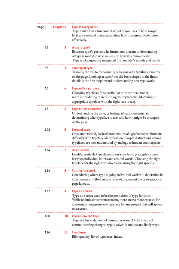
Page 8
Chapter 1
Type is everywhere.
Type exists. It is a fundamental part of our lives. These simple
facts are essential to under stan ding how to communicate more
effectively.
26
38
60
78
2 What is type?
Between type’s past and its future, our present understanding
of type is rooted in who we are and how we communicate.
Type is a living enti ty integrated into society’s moods and trends.
Looking at type.
Training the eye to recognize type begins with familiar elements
on the page. Looking at type from the basic shapes to the finest
details is the first step toward understanding how type works.
Type with a purpose.
Choosing typefaces for a particular purpose need not be
more intimidating than planning your ward robe. Matching an
appropriate typeface with the right task is easy.
Type builds character.
Understanding the tone, or feeling, of text is essen tial in
determining what typeface to use, and how it might be arranged
on the page.
3
4
5
102
6
134
7
154
8
172
9
Types of type.
Once understood, basic characteristics of typefaces can eliminate
difficulty with typeface identification. Simple distinctions among
typefaces are best understood by analogy to human counterparts.
How it works.
Legible, readable type depends on a few basic principles: space
between individual letters and around words. Choosing the right
typeface for the right text also means using the right spacing.
Putting it to work.
Considering where type is going to live and work will determine its
effectiveness. Follow simple rules of placement to create practical
page layouts.
Type on screen.
Type on screen used to be the poor sister of type for print.
While technical restraints remain, there are no more excuses for
choosing an inappropriate typeface for any project that will appear
on a screen.
180
10 There is no bad type.
Type is a basic element of communication. As the means of
communicating changes, type evolves in unique and lively ways.
196
11 Final form.
Bibliography, list of typefaces, index.
�
�
7
This is a sidebar. As you can see
by the small type, the copy here
is not for the faint of heart, nor for
the casual reader. All the infor
mation that might be a little heady
for novices is in these narrow
columns; it is, however, right at
hand when one becomes infected
by one’s first attacks of typomania.
For those who already know some
thing about type and typography
and who simply want to check
some facts, read some gossip, and
shake their heads at my opinion
ated comments, this is the space to
watch.
In 1936, Frederic Goudy was in
New York City to receive an award
for excellence in type design.
Upon accepting a certificate,
he took one look at it and declared
that “Anyone who would letter
space black letter would steal
sheep.” Goudy actually used
another expression, one unfit for
print. This was an uncomfort
able moment for the man sitting
in the audience who had hand
lettered the award certificate.
Mr. Goudy later apologized
profusely, claiming that he said
that about everything.
You might have noticed that my
book cover reads “lower case,”
while here it reads “black letter”–
two very different things. Lower
case letters, as opposed to
CAPITAL LETTERS, are what you
are now reading; black letter
isn’t seen very often and looks
like this.
I’m not sure how “black letter”
in this anecdote got changed
to “lower case,” but I’ve always
known it to be the latter; which
ever way, it makes infinite sense.
By the time you finish this book
I hope you will understand
and be amused by Mr. Goudy’s
pronouncement.
steaLiNg sheep? Letterspacing lower
case? Professionals in all trades, whether they be
dentists, carpenters, or nuclear scientists,
communicate in languages that seem secretive
and incomprehensible to outsiders; type
designers and typographers are no exception.
Typographic terminology sounds cryptic enough
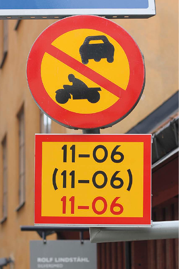
We see so much type
that we sometimes
stop looking. This is
not necessarily a
bad thing, as in the
case of this sign,
which tells us that
we may not enter
this street between
eleven and six, nor
between eleven and
six, and certainly
not between eleven
and six.
to put off anyone but the most hard
nosed typomaniac. The aim of this book
is to clarify the language of typography
for people who want to communicate
more effectively with type.
These days people need better
ways to communicate to more diverse
audiences. We know from experience
that what we have to say is much
easier for others to understand if we
put it in the right voice; type is that voice,
the visible language linking writer and reader.
With thousands of typefaces available, choosing
the right one to express even the simplest
idea is bewildering to most everyone but prac
ticed professionals.
Familiar images are used in this book to
show that typography is not an art for the chosen
few, but a powerful tool for anyone who has
something to say and needs to say it in print or
on a screen. You will have ample opportunity
to find out why there are so many typefaces, how
they ought to be used, and why more of them
are needed every day.
See the changes
made to the sign
in the last two
decades: the
small picture on
the right is
from this book’s
first edition,
printed in 1992;
the one on
its left is from
the second
edition in 2003.
�




 2023年江西萍乡中考道德与法治真题及答案.doc
 2012年重庆南川中考生物真题及答案.doc
 2013年江西师范大学地理学综合及文艺理论基础考研真题.doc
 2020年四川甘孜小升初语文真题及答案I卷.doc
 2020年注册岩土工程师专业基础考试真题及答案.doc
 2023-2024学年福建省厦门市九年级上学期数学月考试题及答案.doc
 2021-2022学年辽宁省沈阳市大东区九年级上学期语文期末试题及答案.doc
 2022-2023学年北京东城区初三第一学期物理期末试卷及答案.doc
 2018上半年江西教师资格初中地理学科知识与教学能力真题及答案.doc
 2012年河北国家公务员申论考试真题及答案-省级.doc
 2020-2021学年江苏省扬州市江都区邵樊片九年级上学期数学第一次质量检测试题及答案.doc
 2022下半年黑龙江教师资格证中学综合素质真题及答案.doc